Most web design mistakes don’t look like mistakes at all. That’s the problem. A website can be visually stunning, polished, and still leave users completely lost the moment they try to do something on it.
That disconnect happens more often than people realise, because good-looking design gets all the praise. But if someone lands on your site and can’t find what they need in the first few seconds, the pretty colors and custom fonts aren’t doing much for you.
This article gets into why so many websites look great but work poorly, and what actually separates beautiful design from design that makes sense to real users.
Web Design Mistakes That Hurt More Than Bad Looks
Winning a design award and actually working for your users are two very different things. Some of the most visually impressive sites out there are also some of the hardest to use.
A messy layout is a major headache. But it’s far from the only design sin that can quietly tank your conversion rates. Let’s look at what else might be driving your visitors away.
When the User Interface Gets Style But Loses Clarity
A cluttered user interface is one of the fastest ways to lose someone. Tiny fonts, zero white space, and busy backgrounds all compete for attention on the same screen. The user ends up scanning the page without landing anywhere useful.
UI Designers Who Forget the User
UI designers sometimes get caught up in what looks fresh rather than what works. Layouts that ignore brand guidelines or chase trends can alienate the very people the site is built for.
After all, a page that impresses other designers rarely connects with a general audience.
Web Design That Skips the “Why”
Every layout needs a clear idea behind it. If a section doesn’t answer something your target audience is already wondering, it’s just filling space. An intuitive page gives users a reason to stay, not just something nice to look at.
UX Design vs. UI Design: What’s Actually The Difference?
UI design is what a site looks like. UX design, on the other hand, is whether it actually works for the person using it. Simple concept, but many teams still treat them as the same thing.
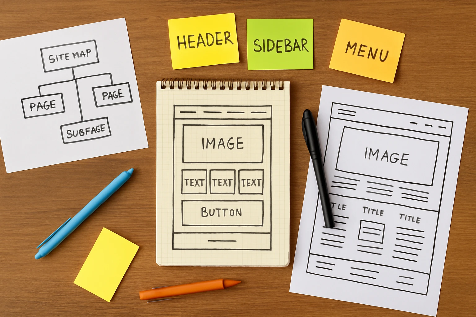
User interface design covers everything visible. For example, the buttons, colors, typography, and spacing. A UI designer is essentially deciding how each element looks and where it sits on the page.

UX design goes a layer deeper. A UX designer thinks about the whole process, how a user explores or gets stuck, whether the experience feels smooth or frustrating (think of UI as the car’s paint job and UX as the steering wheel).
| UI Design | UX Design |
| What users see | What users feel |
| Buttons, colors, fonts | Flow, logic, ease of use |
| How a page looks | How a page works |
| UI designer’s focus | UX designer’s focus |
While a stunning UI catches the eye, it’s a seamless UX that keeps a user engaged. Ultimately, a truly successful digital product requires both disciplines to work in harmony.
The Real Reasons Users Get Lost And How To Fix Them
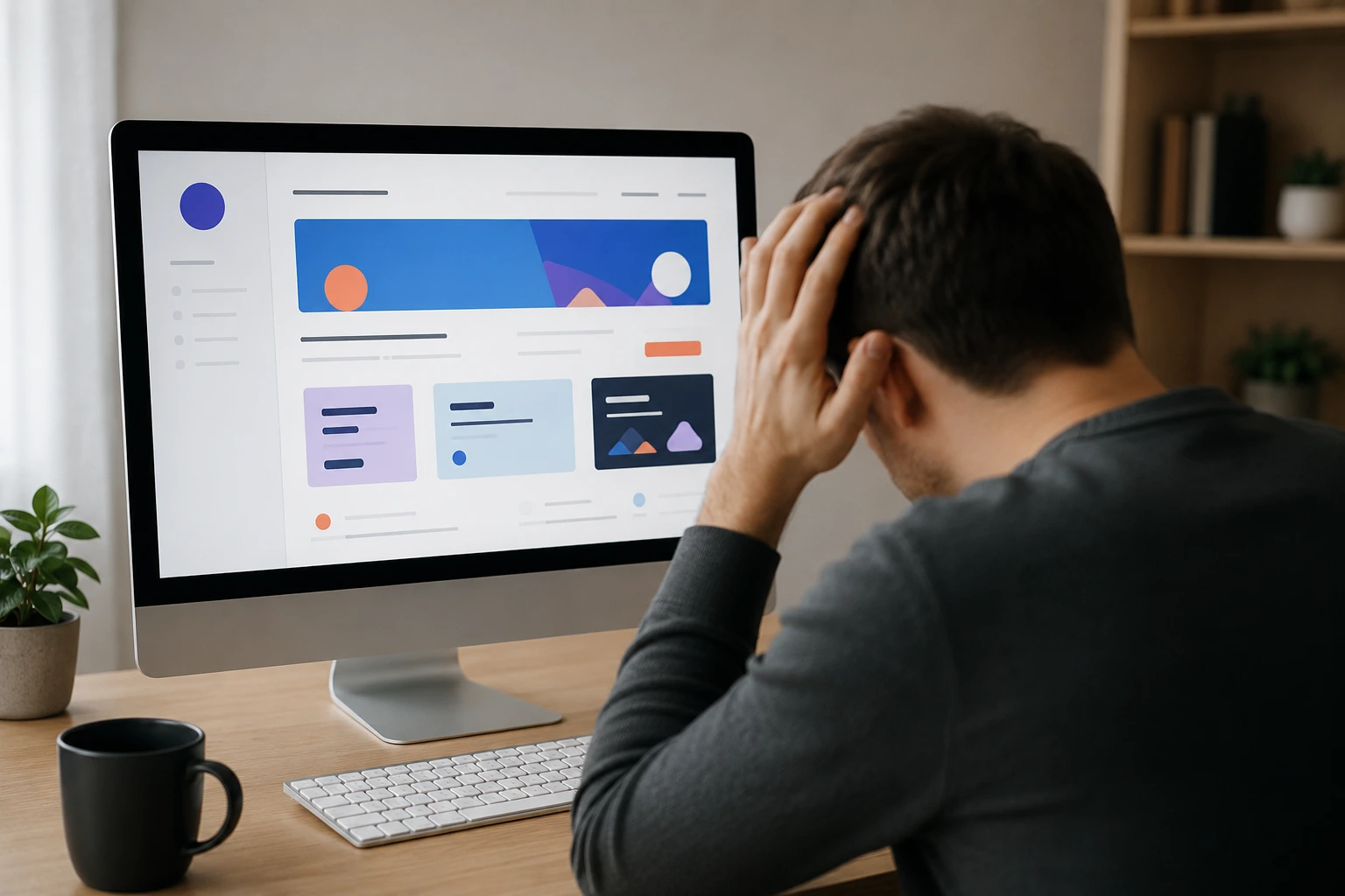
If your analytics show people leaving fast, the problem is rarely the visuals. For instance, users leave because the site feels confusing, slow to use or difficult to browse on smaller screens.
All those issues will be covered in this section for your convenience.
Poor Navigation and Mobile Design Problems

Hidden menus and broken links are mistakes that send visitors away before they even get started. A site that’s easy to browse on a desktop but falls apart on mobile is not user-friendly by any measure.
Users on their phones need to scroll less, tap easily, and collapse navigation menus that actually work. If your links don’t lead somewhere useful, people won’t stick around to discover what else you offer.
User Experience Signals You Might Be Missing
Visitors don’t usually tell you when something feels off on specific pages. Instead, they just leave. High bounce rates and low time-on-page are your clearest signs that something isn’t working.
In our experience running site audits, bounce rate spikes almost always trace back to one broken navigation path or a CTA that doesn’t make sense in context. These small friction points quietly damage how easily users can find what they came for.
What Usability Testing Actually Tells You

Usability testing is the practice of watching real people attempt tasks on your site and noting exactly where they struggle. It’s one of the different methods designers use to implement real improvements rather than guessing.
Even a short session with five users can expose gaps that no amount of internal review would catch. Once you see a real user pause and squint at your nav menu, you never build one the same way again.
Your Website Should Work as Well as It Looks
Great web design only works when it makes sense to the people actually using it. A beautiful platform that confuses visitors is just an expensive first impression. The fixes are rarely dramatic.
And a few improvements can make the site far easier to navigate, including:
- Cleaning up your navigation
- Improving color contrast for accessibility
- Making your layout user-friendly across all devices
- Cutting visual clutter that pulls focus from what matters
Small changes like these create a site that users actually enjoy spending time on.
If you want to build something that looks stunning and performs just as well, Gecko Tag is ready to help. We design websites that look polished and feel easy to use.
Reach out today, and let’s create something worth staying on.
Frequently Asked Questions (FAQs)
These related answers cover the questions that come up most often around web design mistakes and usability.
What Is The Most Common Web Design Mistake Designers Make?
Ignoring how real users interact with a page. Most designers focus on how a site looks rather than how easy it is to locate information, which is where the real problems start.
How Does Ux Design Differ From User Interface Design In Practice?
UI design forms what you see. UX design forms how the whole experience feels across every page of a site or app. Both matter, but they require different thinking.
How Often Should Usability Testing Be Done On A Website?
Ideally, before and after any major redesign. There are plenty of free resources and services available that make testing accessible, even for smaller web projects.
Can A Mobile-Friendly Site Still Have A Bad User Experience?
Absolutely. A site can adapt well to different screen sizes and still confuse users with poor structure, weak search engine visibility, or a layout that makes no sense on the web.