Most websites already have the right content. The problem is how that content is presented. When layout, hierarchy, and styling are unclear, visitors struggle to scan, miss key points, and lose confidence quickly.
Visual web design ideas solve that problem. They influence how information is organised, what stands out, and how easily users move through a page. When these elements work together, static content becomes structured, readable, and memorable
This article breaks down the core principles behind building a stronger visual experience. You’ll learn about layout, hierarchy, typography, motion, and how to bring it all together into a system that works.
Visual Web Design Ideas That Change How People Read Your Site
Good visual web design ideas control where attention goes and whether visitors find what they need before they lose interest. Two common factors behind that are layout and white space. Let’s break each one down.
Use Layout to Lead the Eye
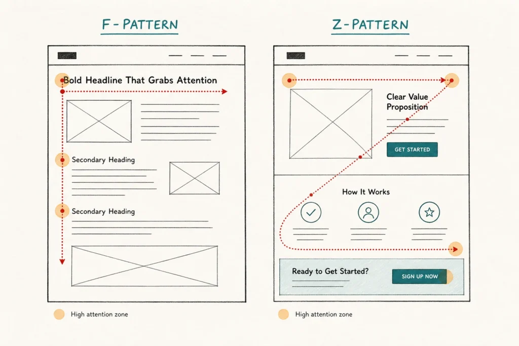
A strong layout creates a natural reading path. Without one, visitors scan randomly, miss key content, and leave without getting the full picture.
Designers typically rely on 2 proven layout patterns to solve this. The F-pattern works well for text-heavy pages, where visitors scan across the top, then down the left side. The Z-pattern suits pages with less text and guides the eye diagonally across the most important elements.
Placing headlines, value propositions, and calls to action in these high-attention areas increases visibility. It also improves the chances that they’ll be seen and acted on.
White Space Is Doing More Than You Think
White space is one of those design ideas that looks passive but does a lot of work. It separates elements, reduces visual noise, and gives each part of a page room to register. When pages have more breathing room, content becomes easier to scan, and each element gets a fair chance to be noticed.
More space isn’t always better, though. Too much of it and the page starts to feel empty, with related content looking disconnected. That’s why we suggest keeping spacing consistent across similar elements. This means matching the gap between headings and body text throughout, so the page feels structured rather than scattered.
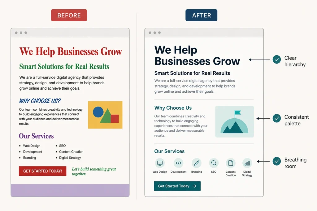
What Is Visual Hierarchy in Web Design?
Visual hierarchy is how designers arrange elements on a page so visitors naturally notice the most important things first. It’s built through size, contrast, color, and placement, each guiding attention in a specific order.
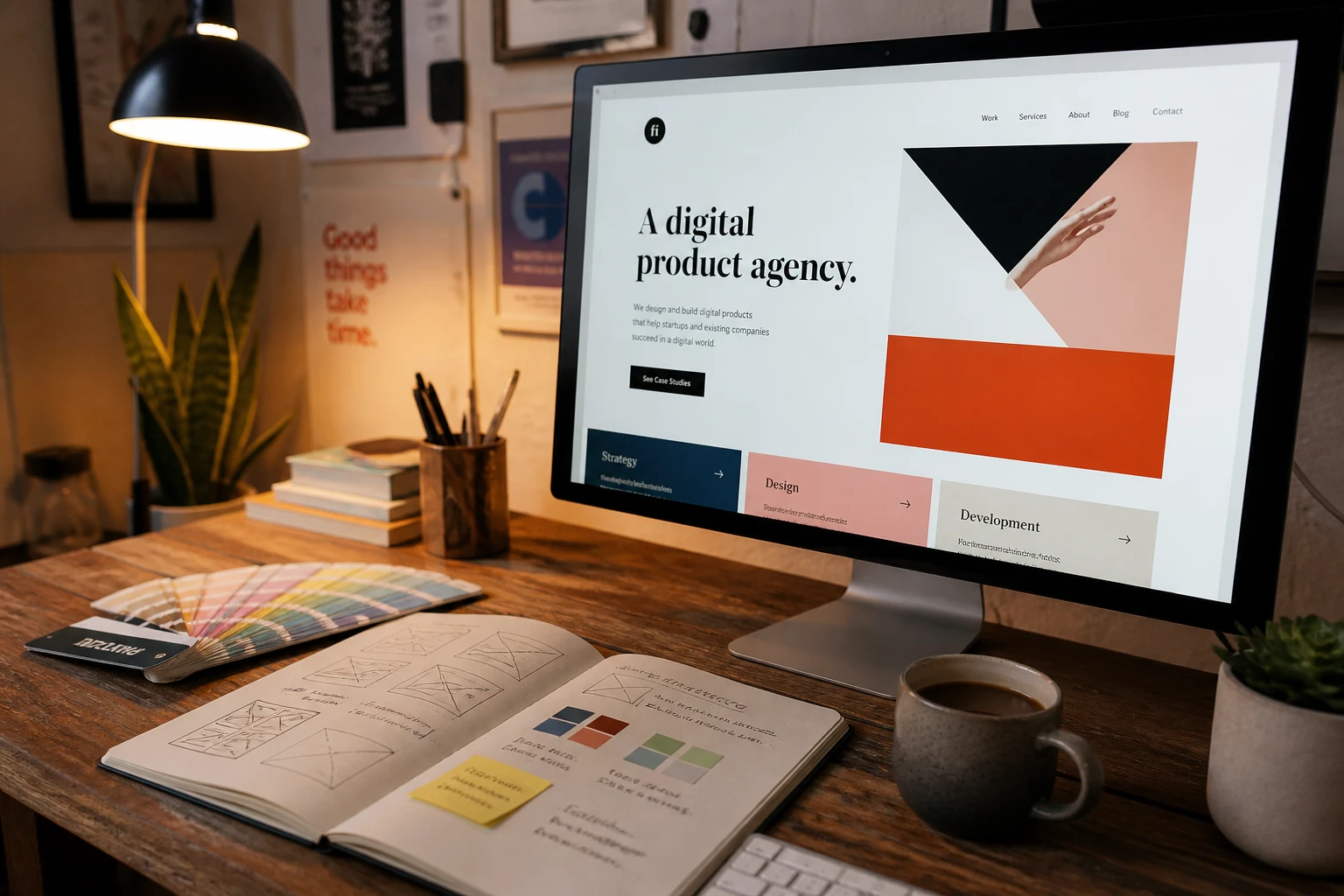
You can see visual hierarchy in action in well-designed landing pages from brands like Apple or Microsoft. Their pages follow a clear visual order. The headline is large and bold, the subheading sits below it, and the body text follows last.
How Typography and Color Influence the Way Visitors Experience Your Content
Of all the visual tools at a designer’s disposal, typography and color do the most heavy lifting. They set the mood before a single word is read. From there, they direct visitors toward what’s important and away from what isn’t. Here’s how each one influences the way people experience your content:
- Font Size and Weight: Confident typography creates a clear reading order without the visitor having to think about it. A bold headline pulls attention first, a lighter subheading follows, and the body text fills in the details. That progression feels natural because it mirrors how we process information in the physical world.
- Color Palette: When someone lands on your site, color registers before anything else. For example, a carefully chosen palette can make a page feel sleek and sophisticated or warm and approachable. This is why modern web design trends like neon gradients and soft shadows are often used to shape the overall feel of a design.
- Consistency: Using the same fonts, colors, and spacing rules across every page keeps the experience feeling cohesive. When visitors move from your homepage to a service page, and everything looks intentional, it reinforces your brand message and builds trust naturally.
Once typography and color come together with intention, the whole page feels different. We worked with a client recently who had a well-written site but inconsistent fonts and a scattered color palette. After tightening both, the site felt more professional without changing a single word.
Modern Web Design Inspiration: Motion, Animation, and Visual Flow
Have you ever visited a website and felt like it was responding to you? Elements fade in as you scroll, buttons react when you hover, and the whole experience feels alive. That’s motion design at work.
Take Stripe’s website as a useful reference point. It uses motion to control pacing through animated gradients, smooth scroll transitions, and timed section reveals.
This subtle control is deliberate. On high-quality websites, motion comes from small, intentional decisions rather than large effects. Micro-animations on buttons, subtle parallax in backgrounds, and responsive hover states all contribute to the same goal. Together, they guide attention and create a sense of continuity that makes navigation feel intuitive rather than forced.
That said, motion should always serve the experience, not compete with it. Animations need to work across every device and browser. A parallax effect that looks smooth on a desktop, for example, can become clunky on mobile.
Heavy animations can also slow load times significantly. If a transition isn’t improving clarity or interaction, it’s probably unnecessary.
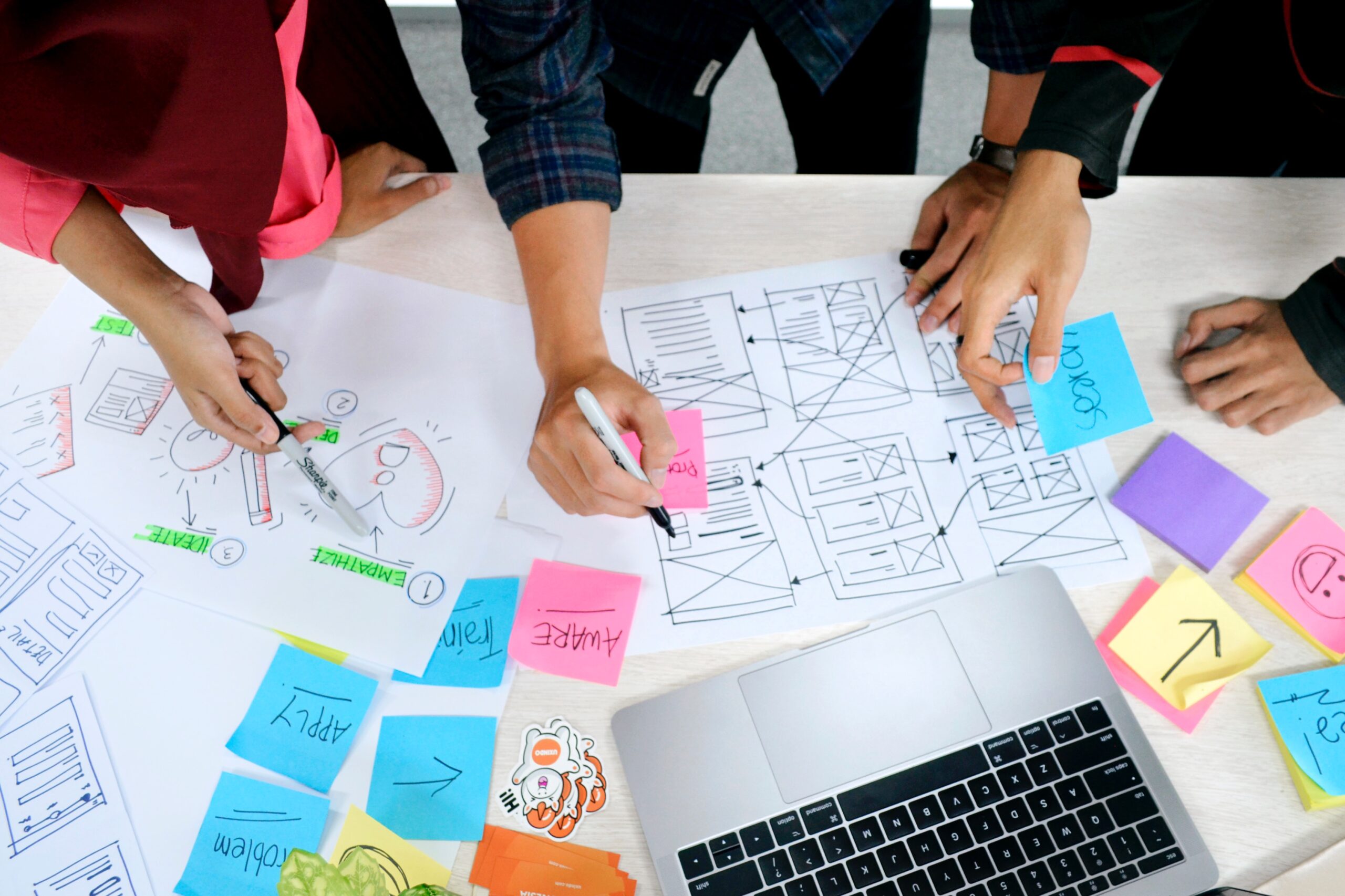
Translating Design Inspiration Into a Working System
Collecting design inspiration is the easy part, but getting a site to look consistent across every page is where most designers hit a wall. In practice, that comes down to two things:
Build a Visual Style That Stays Consistent
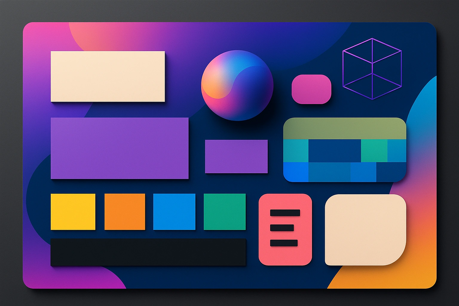
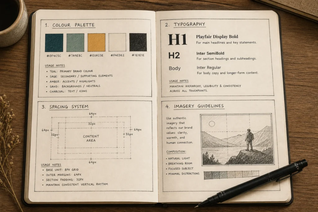
A style guide is the foundation of any consistent website design. It documents your color palette, typography, spacing rules, and imagery guidelines so every new page starts from the same base. Think of it as the rulebook that keeps your brand looking intentional across every page.
Good style guides also leave room for creativity. Instead of restricting design, they remove uncertainty, so new pages can be created quickly without second-guessing every decision. The result is work that feels consistent without feeling repetitive.
Website Design Mistakes That Break the Experience
Even with a solid design system in place, a few common mistakes can unravel the experience fast. Watch out for these:
- Too many fonts or colors competing for attention on the same page
- Poor contrast between text and background, which makes the content hard to read
- No mobile optimization, so visitors on phones get a broken experience
Most of these issues come from decisions made too late in the process. Clear website planning prevents them before they appear.
Ready to Make Your Website Worth Looking At?
Great visual web design isn’t reserved for big brands with large budgets. The principles behind layout, hierarchy, typography, and motion are accessible to any site. And the difference they make is visible almost immediately.
The challenge for most businesses is knowing where to start. A good first step is getting the basics right: layout, hierarchy, and typography. Once that foundation is in place, you can layer in more complex elements like motion or animation.
If you’d rather work with someone who’s done this before, we can help. At Gecko Tag, we build websites where layout, hierarchy, and visual details are decided upfront, so nothing is left to guesswork later.
Get in touch, and we’ll map out a clear direction for your site.