Choosing between minimal and bold website design styles is one of those decisions that feels simple on the surface but quickly gets complicated. Both approaches have produced some of the most recognized sites on the web, and both resulted in real disasters when used in the wrong context.
The style you land on affects how users feel the moment they arrive, how long they stick around, and whether they actually convert. It’s not a small call.
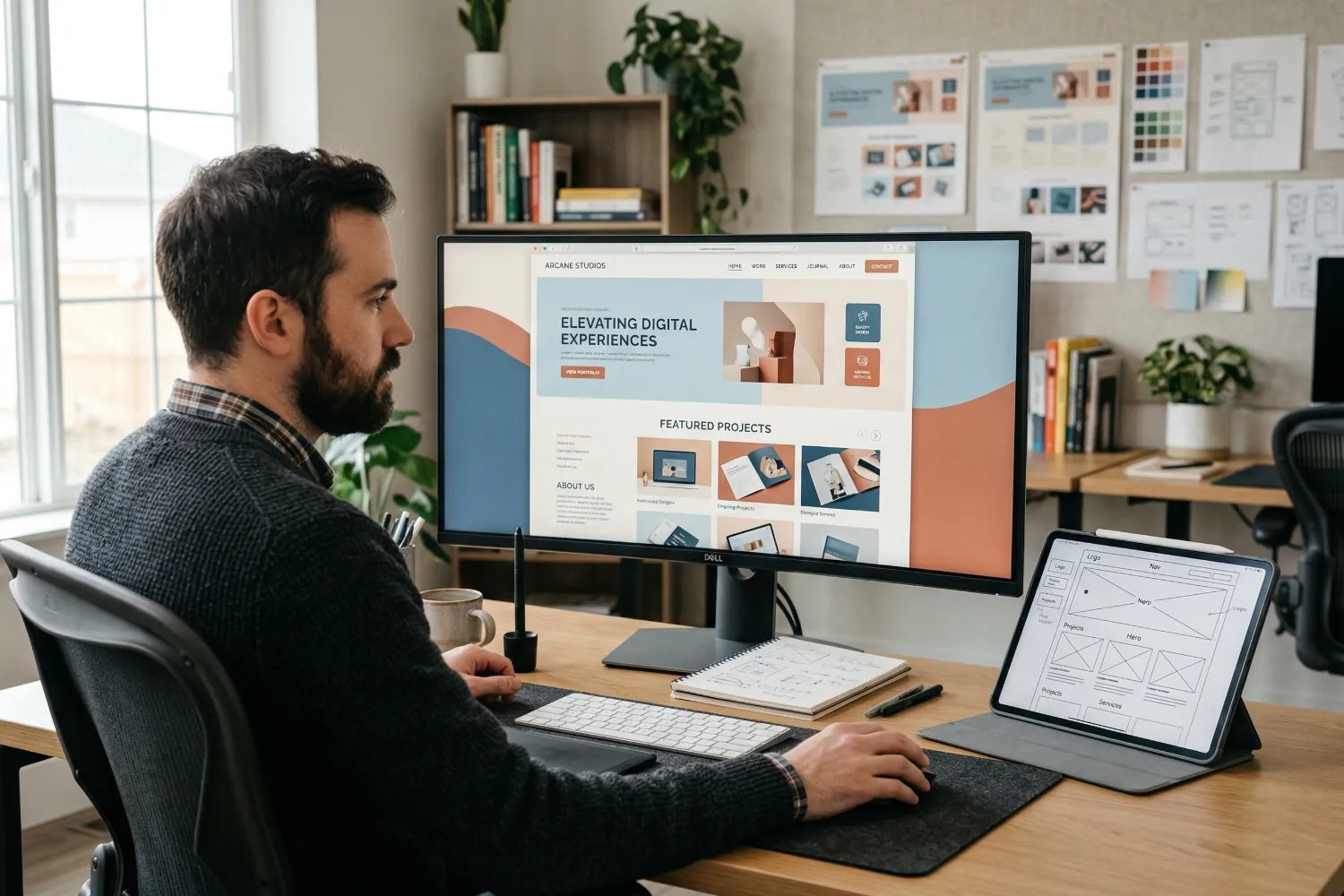
This article breaks down what each style really means, how current design trends are pulling them in new directions, and how to figure out which one actually fits your brand.
Minimal vs Bold: What Do These Website Design Styles Actually Mean?
At first glance, minimal and bold web design look like total opposites. And honestly, they kind of are. So, let’s break down both, starting with the one that does more with less.
What Makes a Minimalist Website Work
The foundation of minimal website design is restraint. White space and negative space do a lot of the heavy lifting here, improving clarity and giving the design a more balanced feel.
The layout stays clean and easy to scan. Key elements like navigation, headlines, and calls to action remain prominent without competing for attention. This simplicity benefits both usability and performance.
In fact, the probability of a visitor bouncing increases by 32% when page load time rises from one second to three seconds, which helps explain why streamlined designs often deliver better results.
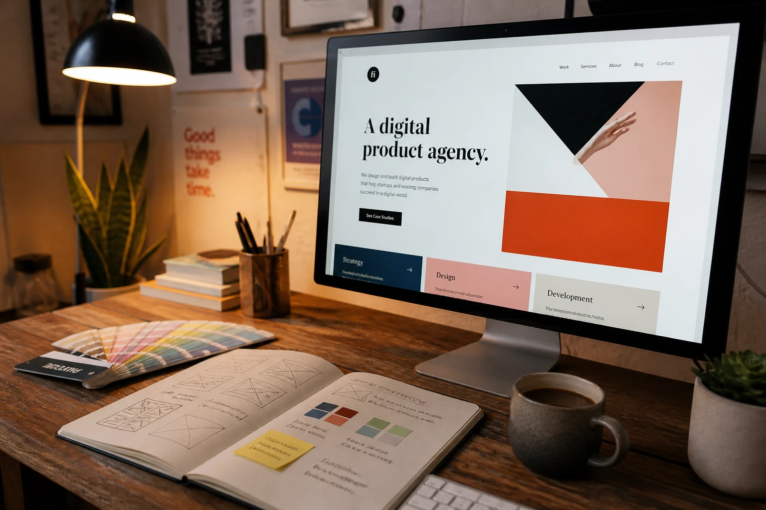
What Bold Design Really Looks Like
Bold web design is the opposite of playing it safe. It leans into strong visuals, vibrant color palettes, and oversized typography to create something visually striking from the very first second.
The structure is still intentional, but the visual elements are turned way up. Bold design steps forward and makes the user feel connected before they’ve read a single word.
Brands like Spotify and Liquid Death are solid examples. Their sites are loud, layered, and completely on-brand in a way that’s genuinely hard to ignore.
Design Trends Shaping the Way Users React

Design trends in 2026 are not just aesthetic shifts. They are actively changing how users process and respond to websites in real time. Designers are also pushing boundaries further than ever, and digital experiences are getting harder to put into neat little boxes.
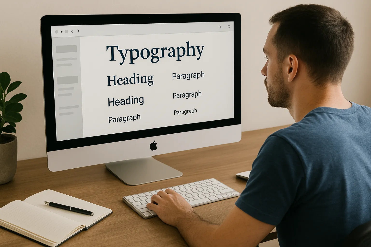
Color Palettes and Typography: The First Things Users Notice
Users form a visual impression within a few milliseconds, and color and typography are the two biggest drivers of that first reaction.
For instance, saturated neon tones, bold accent colors, and high-contrast pairings are leading the bold design trends right now. On the minimal side, neutral tones and clean fonts keep things timeless and easy to read.
Typography has also taken center stage as a design element in its own right. Bold text, expressive font pairings, and oversized headlines are now core parts of visual storytelling. The aesthetic appeal of a page often comes down to how well the type and color work together before the user reads a single line of copy.
Motion, Depth, and User Attention: The Bold Side of Web Design
The best part about motion and depth in web design is that they guide user attention without needing more copy or harder sells.
In the same light, scroll-triggered subtle animations and interactive elements are becoming standard in bold, immersive web experiences. As users scroll through a page, motion design pulls their focus exactly where it needs to go.
For example, brands like Nike use subtle hover effects and interactive depth to make every scroll feel purposeful. Drawing from our experience, even small motion touches on a web page can noticeably lift how long visitors stay and how far they go.
Which Style Fits Your Target Audience and Goals?
Picking a design style based on what you personally like is one of the most common mistakes designers make. Your target audience should really be driving this decision, and a deep understanding of their expectations will get you further than any mood board.
The table below compares minimal and bold design styles across key factors, helping you determine which approach best aligns with your audience, goals, and brand experience.
| Minimal | Bold | |
| Best for | SaaS, finance, law, high-end products | Beauty, lifestyle, entertainment, youth brands |
| User needs | Clarity, speed, trust | Emotion, excitement, experience |
| Conversion goals | Single-focused CTA | Exploration and engagement |
| E-commerce | Clean product focus | Immersive brand story |
| Mobile devices | Loads fast, easy to scan | Needs careful optimization |
High Converting Landing Pages: Does Minimal or Bold Win?
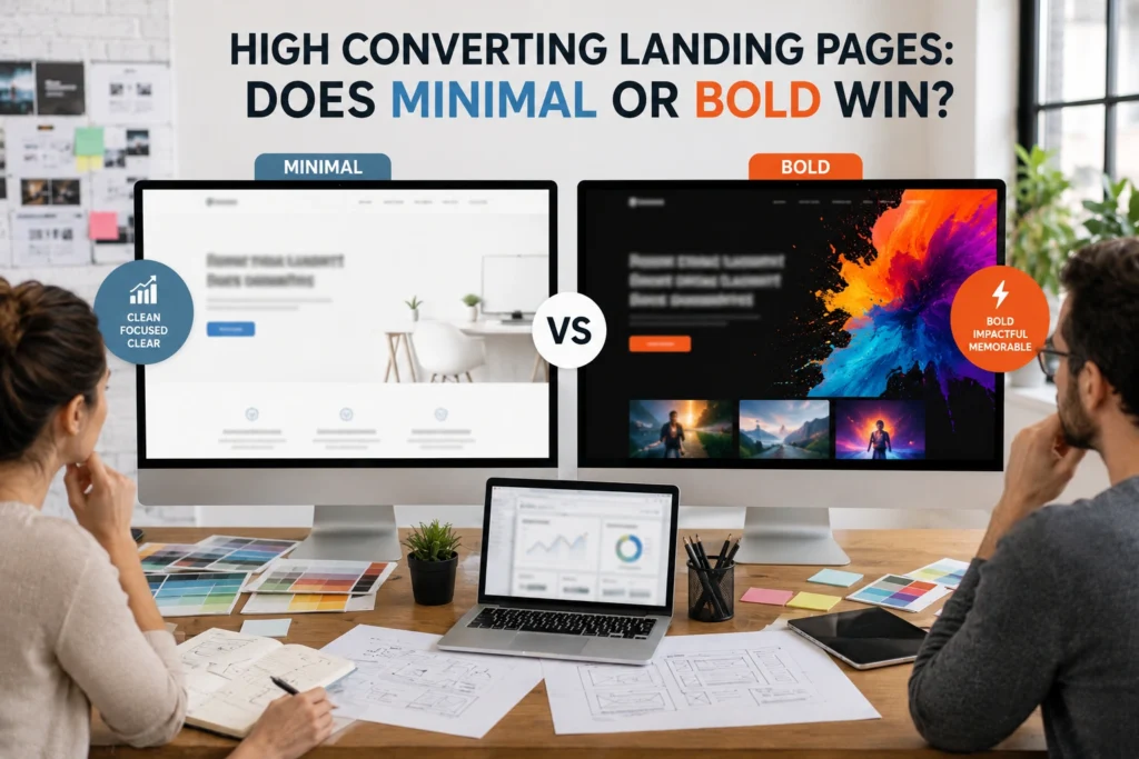
Most designers assume minimal always wins on landing pages. The data tells a more interesting story, and the honest answer is that it depends on what you’re selling and who you’re selling it to.
Minimal landing pages remove distractions and push users toward a single CTA more cleanly. The value proposition is front and center, and there’s nothing pulling attention away from the conversion goal. That’s why so many high-converting pages in SaaS and finance lean minimal.
On the other hand, bold landing pages work well when the product is visual, emotional, or experience-driven. A beauty brand or a music festival site needs to make users feel something first. Getting that emotional hit right can do more for your conversion rate than any amount of copy tweaking.
CTA Buttons, Social Proof, and the User-Friendly Factor
Getting your CTA buttons, social proof, and layout hierarchy right can lift conversions without changing a single word of your copy.
Here, CTA buttons perform better when they contrast sharply with the surrounding page layout, and that applies to both styles. For example, a clear CTA on a minimal page is easy to spot. However, on a bold page, it needs to stand out even against a busy background, which takes a bit more thought.
Social proof, like reviews, logos, and ratings, also needs breathing room. A clear hierarchy and separated sections help users find and trust that information without feeling overwhelmed. User-friendly design makes the next step obvious, regardless of how minimal or bold the overall design is.
Where to Find Design Inspiration That Actually Fits Your Brand
Now that you know which style direction fits your audience, the next step is finding real-world examples that bring it to life. Good design inspiration should push your thinking, not just confirm what you already had in mind.
Sites like Awwwards, Behance, and Dribbble showcase strong examples across both web design styles. Spending even 20 minutes browsing your niche on those platforms gives you a clearer picture of what your audience already responds to visually.
Based on our firsthand experience, studying competitor sites is one of the most underrated sources of design ideas. You get to see what’s working in your space right now, and you can spot the gaps that your own site could fill.
How to Choose the Right Style Without Second-Guessing Yourself
The good news is you don’t have to guess. There are a few practical ways to land on the right style with confidence. Eventually, most of them come down to asking the right questions before you open a single design file.
Here are some good starting points:
- Brand Personality: You should think about whether your brand comes across as quiet and refined or loud and expressive. The overall design direction should reflect that naturally, not fight against it.
- User Journey: By mapping out where users land first and what action you need them to take. The design style should guide users toward that action without creating friction along the way.
- Existing Data: If you already have a site, your analytics are telling you something. Low engagement and high bounce rates are a pretty clear sign that the current design is not connecting.
This way, your design choices become a lot easier when you start with these three questions instead of jumping straight into visual elements.
Can Your Conversion Rate Tell You Which Style to Use?

Your analytics already know which design style your users prefer. The tricky part is knowing where to look and what the numbers are actually telling you.
A/B testing minimal vs bold layouts on the same landing page is one of the clearest ways to get a real answer. You put both versions in front of real users and let the conversion rate do the talking. It takes a bit of setup, but the data you get is worth it.
Bounce rate and time on page are also strong signals that your current design style may not be working. Even small structural changes, like simplifying a cluttered header or making a CTA button more visible, can shift how users engage with a page in a measurable way.
Minimalist Websites vs Bold: A Quick Side-by-Side
Now that we’ve covered how to evaluate your options, here’s a quick comparison to make the final call a little easier. Sometimes seeing it laid out plainly is all you need.
| Minimalist Design | Bold Design | |
| Feel | Clean, calm, trustworthy | Energetic, expressive, immersive |
| Best features | Fast load, clear structure, easy scanning | Strong visuals, rich color, high impact |
| Screen sizes | Performs well across all screen sizes | Needs testing on mobile devices |
| Audience | Professional, detail-oriented users | Younger, experience-driven audiences |
| Weakness | Can feel cold or plain if overdone | Risk of overwhelming users |
Both styles have real strengths, and the right one for your site comes down to who you’re building it for.
Minimal or Bold: Making the Right Choice for Your Website
There’s no universal winner between minimal and bold. The right website design style is simply the one that serves your users, supports your goals, and feels true to your brand. Eventually, getting that right from the start saves a lot of backtracking later.
Working with an experienced web design team takes a lot of the guesswork out of this. You get a site that’s been thought through properly, not just one that looks good in a mockup.
That’s exactly what we do at Gecko Tag. If you’re ready to build something that actually works for your audience, get in touch with us, and let’s create it together.