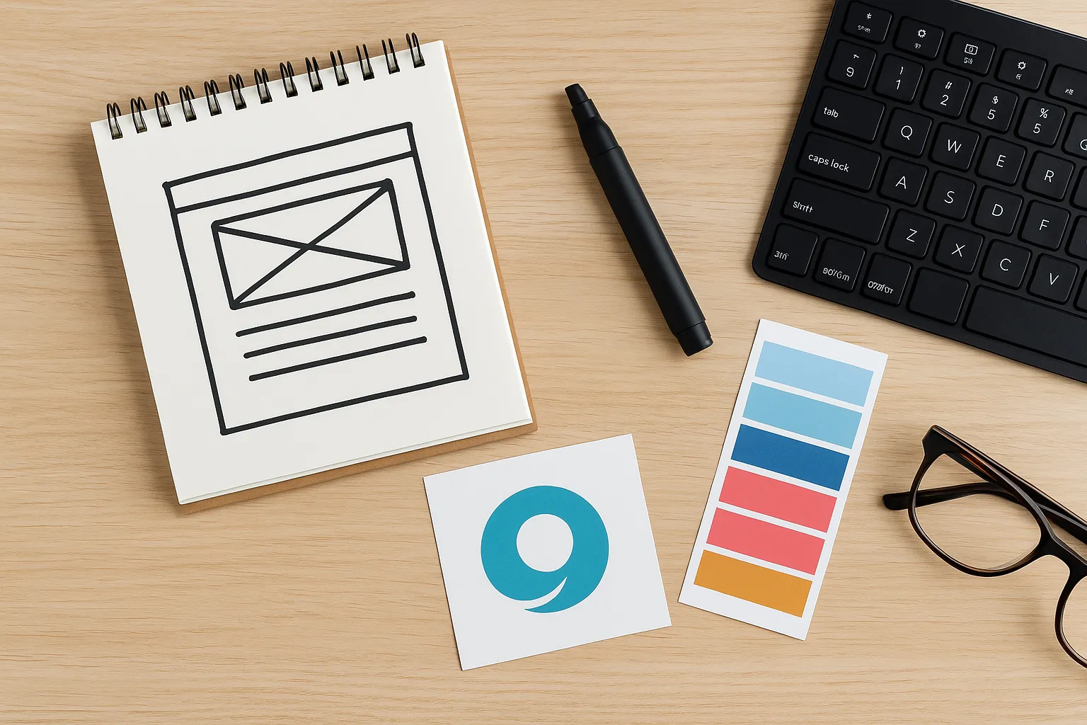
Looking for web design trends that will actually work in 2025? We analysed more than 20 websites this year and tracked which design approaches drove the strongest user engagement.
The result surprised us. Minimal design and clean layouts dominated 2024. But people were engaging less with these minimalist sites, while bold, expressive layouts were getting way more clicks and longer visit times.
We’re GeckoTag Web Design, and we’ve helped over 200 businesses build websites that connect with their audiences. In this guide, we’ll share new web design trends for 2025, based on our experience, with real examples.
Let’s get started.
Bold Typography Takes Centre Stage
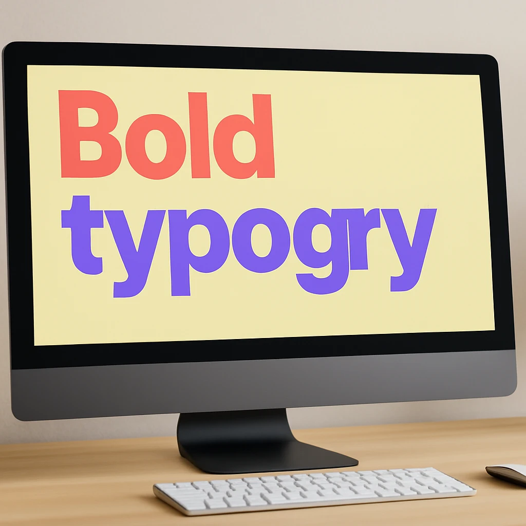
Typography isn’t hiding in the background anymore. In 2025, fonts are the main event, taking up serious screen space and doing the heavy lifting in web design.
Oversized typography works because of how people actually browse websites. You land on a page and scan for something clear and bold to guide you. Large fonts direct your eye where it needs to go without making you hunt for information.
Mobile makes this even more important. Squinting at small text on a phone? Most people won’t bother.
Our team has found that oversized type works best when paired with ample breathing room. Take Stripe, for example. They use 72pt headlines on their product pages while keeping everything crystal clear. The typography itself becomes a design element, not just a container for words.
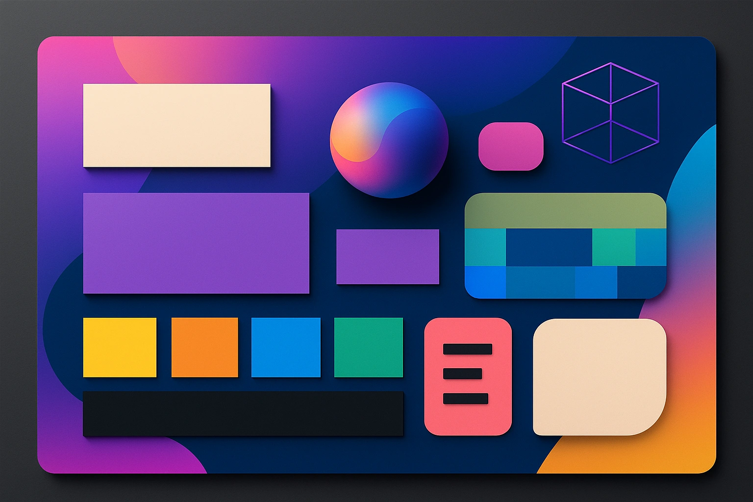
Vibrant Colour Palettes Replace the Greys
Grey and minimal websites dominated for years. Now designers are bringing back bold, saturated colours.
Colour is the first thing people notice when they land on your site. Bright colours create a clear visual hierarchy, so visitors know where to look. They also make your brand more memorable. A site with a strong colour palette sticks in people’s minds longer than another grey minimalist design.
Vibrant CTAs perform better, too. A bright button against a neutral background gets more clicks than a subtle one blending into the page.
Take Poppi’s website. They use golden yellow throughout their hero sections and product cards. The bright, playful colours match their brand and make them instantly recognisable. You won’t mistake their site for anyone else’s.
Bento Grids Add Personality Without Chaos
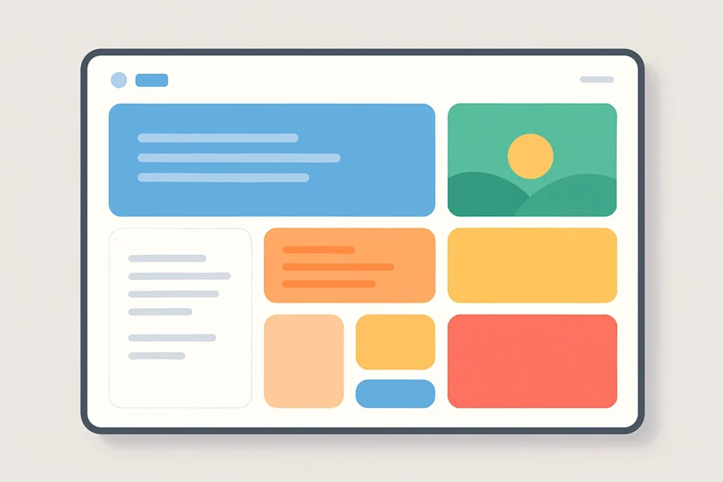
Think of a Japanese bento box. Each section gets its own neat compartment, but everything fits together in one cohesive meal. Bento grids work the same way for websites.
This layout solves a big problem. Traditional grids treat every piece of content equally, so nothing stands out. Bento layouts let you prioritise visually. Your main message gets a large space that dominates the page. Supporting features sit in medium spaces without fighting for attention. CTAs tuck into smaller corners, appearing right when visitors need them. The hierarchy builds itself.
Plus, it works beautifully on mobile. Unlike complex layouts that break awkwardly on phones, bento sections stack naturally. Everything stays easy to tap and scroll, with no weird cropping or tiny text.
Apple’s website shows this in action. Their product pages use varied block sizes to guide your eye from feature to feature without overwhelming you.
Motion Design Makes Every Interaction Feel Alive
Static websites are starting to feel lifeless. In 2025, motion design is everywhere, from subtle hover effects to kinetic typography that transforms as you scroll.
What does motion do that static design can’t?
It brings personality through movement. A playful bounce conveys something totally different from a smooth fade. Quick snaps feel urgent, while slow glides feel luxurious. These tiny movements express brand character instantly, something static elements have to work much harder to achieve.
Motion also turns browsing into an experience. Stripe’s homepage uses micro-animations that respond as you move your cursor. Elements float, shift, and react in real time. It makes exploring the site feel interactive rather than passive.
The feedback loop is important too. When elements respond to your hover, click, or scroll, the site feels alive instead of frozen. That responsiveness builds trust. Users instinctively feel like the site is paying attention to them.
Interactive 3D Elements Let Visitors Explore
3D design makes scrolling feel like play. You can spin products, rotate objects, and actually understand them instead of squinting at flat images.
Campo Alle Comete features interactive 3D content that reacts to cursor movement. As you move the cursor, objects shift and reveal new angles, creating an engaging, immersive experience.
3D elements are especially beneficial for business owners. When visitors can examine products from every angle, they understand what they’re buying. Their confidence goes up, questions go down, and conversions often improve.
You might wonder why we’re only seeing this now. Technology finally caught up. What used to lag or crash now runs smoothly, even on mobile.
Dark Mode: A Modern Look with Practical Benefits
According to Android Authority, about 82% of mobile users prefer darker interfaces. If your website doesn’t offer dark mode, you’re potentially turning away a massive portion of visitors. Even iOS, Android, and major browsers now include it as a standard feature.
What makes it worth the effort?
Most of your visitors spend hours staring at screens. Dark mode reduces eye strain in low-light settings and saves battery on OLED screens.
But there’s a design bonus too. Dark backgrounds make neon highlights and bold typography pop dramatically. Your site looks more modern.
Awwwards showcases this perfectly. Many featured portfolio designs now default to dark mode or offer a seamless toggle. Some designers even build for dark first, then add light mode as the alternative.
Custom Illustrations Set You Apart
When every website uses the same stock photos, they blend together. Custom illustrations break the pattern and give people something fresh to look at.
It’s because custom work shows visitors you care about details. It signals personality and makes your brand feel human. More importantly, illustrations tell stories and simplify ideas in ways photos can’t. They make abstract concepts clear and turn complex processes into something approachable.
Duolingo proves this beautifully. Their green owl mascot and playful character animations are instantly recognisable. The illustrations make learning a new language feel friendly instead of intimidating. Users stay engaged because the visuals create an emotional connection that generic imagery never could.
Pro tip: Even simple line drawings can outperform stock photos if they’re designed specifically for your message.
Websites Don’t Have to Be Boring Anymore
In 2025, websites look different. Typography grabs attention. Colours stick in memory. Grids stay organised without putting people to sleep. Motion adds life. 3D elements invite exploration. Dark mode gives eyes a break.
What connects all of this? Expression. Designers are picking personality over perfection and energy over sameness. Your website doesn’t need to blend in anymore. It can move, adapt, and actually stand out.
The tools exist. The trends are proven. You just need to take the first step.
Ready to build a website unique to you? Contact us at Gecko Tag, and we’ll help bring your vision to life.