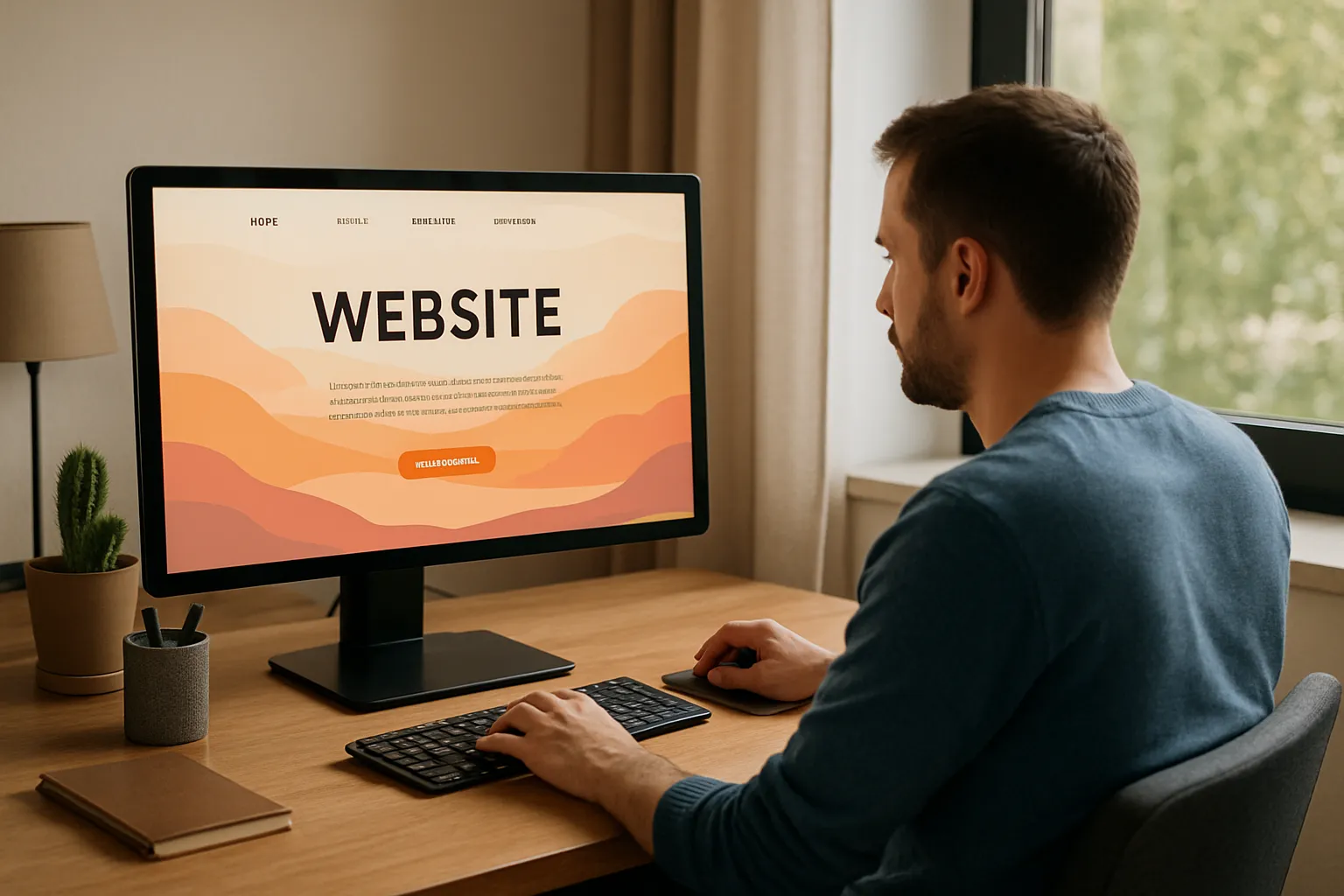
Your website has about three seconds to grab someone’s attention. If nothing responds to their actions, they’re gone. Take it from us, static pages just don’t work anymore.
Don’t worry, though; you can change this with interactive web design. When buttons react to hovers, when animations guide people through content, when features let visitors control their experience, they tend to stay longer and explore more. Sites with these elements also consistently see better engagement numbers.
This article covers the interactive elements that actually work. You’ll learn which features boost user engagement, how to track their impact, and practical ways to improve your site over time.
Let’s get into it.
What Makes Web Design Interactive?
Did you know most visitors decide within 3 seconds if they’ll stay on your site or leave? That split-second judgment often comes down to one thing: does the page feel alive or does it feel dead?
Interactive web design means your website responds to what users do. Instead of presenting static information that just sits there, interactive elements react and give feedback. They make browsing feel like a two-way conversation rather than reading a brochure.
Let’s break it down:
Hover States That Respond
Move your cursor over a button and watch it change colour or grow slightly. That’s a hover state. It tells you “yes, this does something” before you even click.
Good hover effects are unavoidable because they make your site feel polished and help people understand where they can interact.
Animations That Guide
Subtle animations direct attention to important content as you scroll. For instance, a fade-in effect on your services section or a smooth transition between pages keeps the experience flowing naturally.
The right animations make navigation feel effortless and keep the user engaged.
Features Users Can Control
Here are some elements people can actually manipulate:
- Sliders that adjust pricing estimates.
- Tabs that switch between different service options.
- Video players with custom controls.
These features let visitors change what they see to their own needs, which creates a genuine, two-way dialogue between you and your audience.
But why is it significant for your business? It’s time to get insights about this.
Why Interactive Features Boost User Engagement

We’ve all landed on a site that made us want to click around and explore. Then there are the ones where we scan once and immediately hit the back button. The difference usually isn’t the information itself; rather, it’s how that information is presented and how the site makes you feel while you’re there.
Interactive features tap into something basic about how humans engage with their environment. We’re wired to respond to things that respond to us. So when you click a button and it reacts, your brain registers that as a rewarding experience. It’s the same principle that makes physical shops with hands-on displays more memorable than ones where everything is behind glass.
The impact shows up in your analytics as well. For example, time spent on interactive pages consistently ranks higher than static ones, because people have reasons to explore beyond the first thing they see.
You can build on this by adding a configurator that lets visitors build their own package; this keeps them engaged far longer than a simple price list. Plus, having a live chat that pops up at the right moment can turn a quick visit into an actual conversation.
Interactive elements also give visitors a sense of control over their experience. Instead of forcing everyone through the same rigid path, you let them choose what’s relevant to them. And that respect for their time and preferences doesn’t go unnoticed.
Interactive Web Design Elements That Engage Users
You’ve probably seen some of these features on your favourite sites without even thinking about them. Because the best interactive elements don’t announce themselves, they just make the experience better.
Here are some elements we recommend:
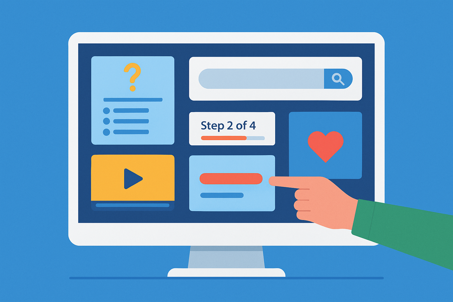
Quizzes and Surveys
These are brilliant for engagement because they do double duty. Someone spends three or four minutes answering questions about their needs, and you’ve gathered valuable insights about what matters to them.
They’ll get personalised recommendations or results, and you’ll get the data that helps you understand your audience better. From our experience, even a simple “What type of service fits your business?” quiz can keep users on your page far longer than any blog post.
Live Search Option
When the user types in a few letters and relevant results will appear instantly. They don’t have to wait for a new page to load or face dead ends while looking for their answer. This is also especially useful for businesses with lots of services or products.
Video Content
A 60-second clip of your app in action gives visitors more understanding than paragraphs of description. The bonus here is that video naturally increases time spent on your pages.
Visitors will watch a helpful demonstration, but they’ll skim past text that covers the same ground.
Progress Bars
When someone fills out a contact form or works through a multi-step process, showing them “Step 2 of 4” reduces abandonment and sets expectations.
Nobody wants to start something without knowing how long it’ll take. And these small visual cues encourage users to complete the process instead of giving up halfway through.
Responsive Animations
Micro-interactions are the tiny animations that happen when you interact with something. For example, a button that slightly changes colour when you hover or a “like” icon that bounces when clicked.
These details make your site feel polished and responsive, and give users immediate feedback that their action has been registered.
Of course, you’ll want to know if these elements are actually working for your business.
How to Measure User Engagement
A lot of business owners add interactive features to their website, then never check if anyone’s actually using them. But you can’t improve what you don’t measure.
The metrics that reveal user engagement aren’t complicated, but you do need to know which ones are important. Let’s start with the most basic one:
Time on Page
When users spend two minutes exploring your services instead of fifteen seconds, that’s meaningful change. Analytics platforms track this automatically, so you can easily compare your pages with interactive features against those without them.
Simply put, if people linger longer on certain pages, those elements are working. If they don’t, you’ve got a clear signal that something needs to change.
Bounce Rates
A high bounce rate means visitors land on your page and leave without exploring further. If you’ve added an interactive calculator to your pricing page and the bounce rate drops by 20%, you’ve got proof it’s effective.
Exit pages work similarly: they tell you exactly where people give up during their journey through your site. The trick is to track these before and after adding new features so you can measure real impact.
Scroll Depth
Heatmap tools show you how far down the page people actually scroll and which elements they click most. You might discover that users engage heavily with your comparison tool but completely ignore the section below it.
Once you spot these patterns, you can decide what to prioritise and what to rethink.
Conversion Tracking
Engagement is nice, but conversions pay the bills. Start by tracking how many people begin your contact form versus how many actually finish it. Then monitor which calls to action get the most clicks.
Also, set up goals in your analytics for the actions that drive your business forward, and watch how interactive features impact those numbers.
User Feedback
Sometimes the metrics look solid, but people still complain. Other times, the data seems average, but customer feedback is glowing; that’s why you need both. We recommend sending short surveys asking what visitors found helpful or frustrating, and going through comments and reviews.
Once you know which metrics matter for your business, checking them becomes part of your routine instead of something that feels overwhelming.
How to Create an Intuitive Navigation
We’ve all landed on a site where finding anything felt like solving a puzzle. You click around, hoping something leads where you need to go. After thirty seconds of frustration, you leave and find a competitor whose site actually works.
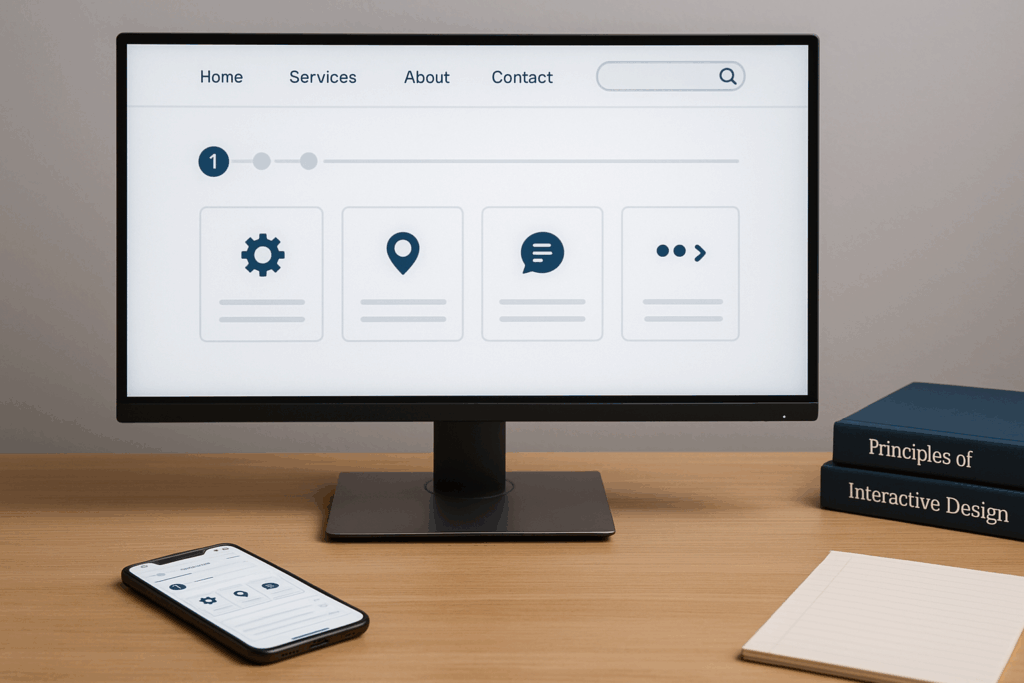
Intuitive navigation is the foundation that lets other interactive elements shine. Your stunning animations don’t mean much if users can’t even find them.
Restructure Your Menu
Use clear, simple labels that describe what someone will actually find when they click. For example, “Our Services” works better than “Solutions Portfolio.” And it’s best to keep your main navigation to five or six items at most.
Optimise Mobile Navigation
Test your mobile menu on an actual phone, not just in your browser’s developer tools. You’ll notice the experience changes when you’re using your thumb instead of a mouse.
Improve Search Functionality
Once you’re past ten or fifteen pages of content, users appreciate being able to type what they need. So, make your search bar easy to spot and ensure it returns relevant results instead of dead ends.
Add Breadcrumbs
Breadcrumbs help people understand where they are on your site. These little trails at the top show “Home > Services > Web Design.” This way, visitors can jump back to any previous level without using the back button repeatedly.
When navigation works properly, users focus on your content and services instead of figuring out how to use your website.
Refine Your Interactive Design Over Time
And here’s where the real improvements happen. You’ve added interactive features and you’re tracking the right metrics. Now comes the part that separates websites that get better from ones that stay the same.
Once you start making these changes based on actual data, you’ll notice patterns you couldn’t see before.
- Analyse user behaviour patterns: Heatmaps and session recordings show you exactly how people interact with your site. You’ll see where they hesitate, what they click repeatedly, and where they get stuck.
- Test variations: A/B testing lets you compare different versions of interactive elements (e.g., button colours or progress bars) to see what actually works better. Run these tests long enough to gather meaningful data, usually at least a week or a couple of hundred visitors per variation.
- Act on customer feedback: Combine what people tell you with what your data shows. If your metrics say users spend lots of time on a page but your surveys say they found it confusing, that’s valuable information.
Pro tip: Pay attention when multiple people mention the same issue.
Time to Put These Ideas Into Action
Now that we’ve explored how interactive design boosts user engagement, you’ve got a clear picture of what works and why it’s important.
We covered the elements that make websites feel responsive, from hover states and animations to quizzes and live search. You learned which metrics tell you if these features are working. And you saw how to refine your approach over time using real data instead of guesswork.
Your website should work as hard as you do. If you’re ready to create a more engaging online experience that turns visitors into customers, Gecko Tag can help you build it. Let’s make your site one people actually want to spend time on.