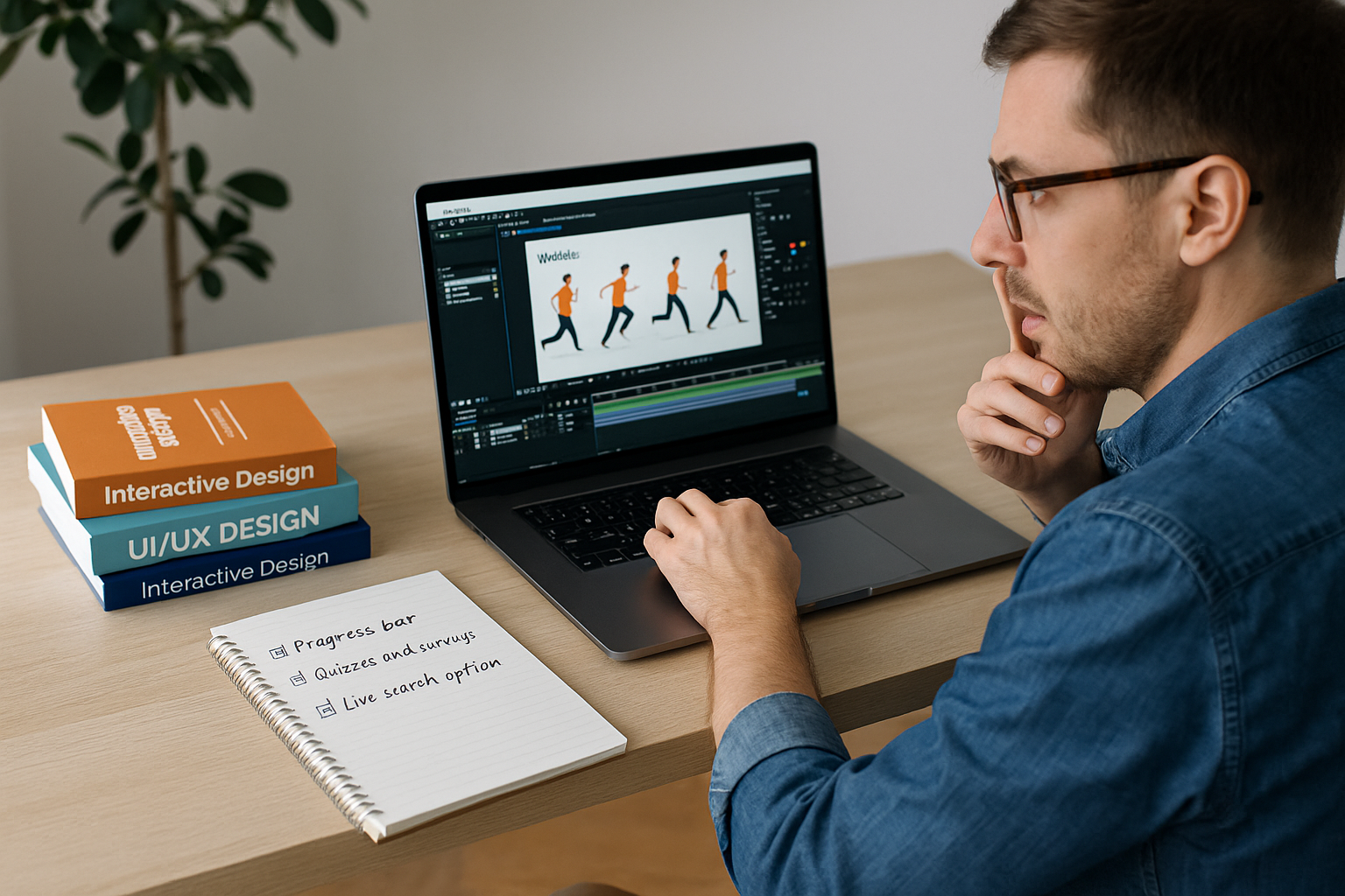
An easy-to-use website starts with mapping your pages, understanding your audience, and structuring content so visitors instantly know where to go. And when these steps are missing, you’re likely to land on a website and feel completely lost.
Studies show that 38% of visitors will stop engaging with a site if the layout looks unattractive or confusing. That’s nearly 4 out of 10 people gone before they even read your content. And the reason is often just poor, unclear website planning.
Which is why we’re going to talk about those common layout mistakes and how to avoid them. You’ll learn how to organize your pages, guide visitors naturally, and pick layouts that actually work.
It’s time to build a website that feels easy to use.
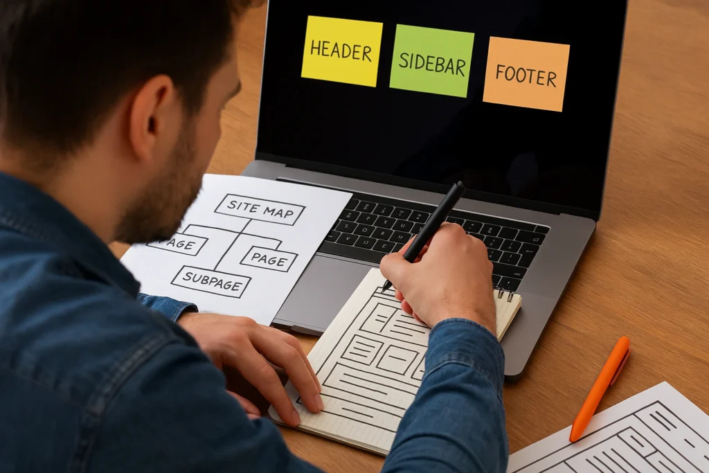
What Is Clear Website Planning?
Clear website planning is the process of organizing your site’s structure, content, and navigation before you start designing anything.
A solid website plan maps out where everything belongs, how pages connect, and what site visitors should do when they arrive. But without a plan, even the prettiest websites lead to confusion, wasted time, and missed opportunities.
If you need more reasons why a clear website layout is important, this section explores exactly that.
Why Good Website Layout Is Important for Users
A good website layout keeps visitors engaged longer and helps them find exactly what they came for. And honestly, users judge your site right off the bat, often within 50 milliseconds. If the website layout feels cluttered or confusing, they assume the business behind it is the same(that’s not the impression you want to make).
A good website layout, however, builds trust. It shows your target audience that you care about their experience. And when visitors feel comfortable, user engagement goes up. They stay longer, navigate more, and are far more likely to take action.
On the flip side, a poor layout builds up frustration, higher bounce rates, and missed conversions. So yes, your user-friendly layout is necessary.
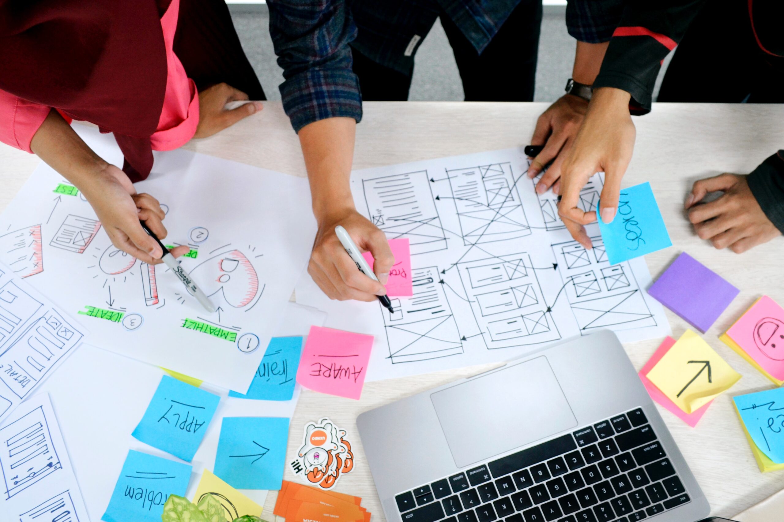
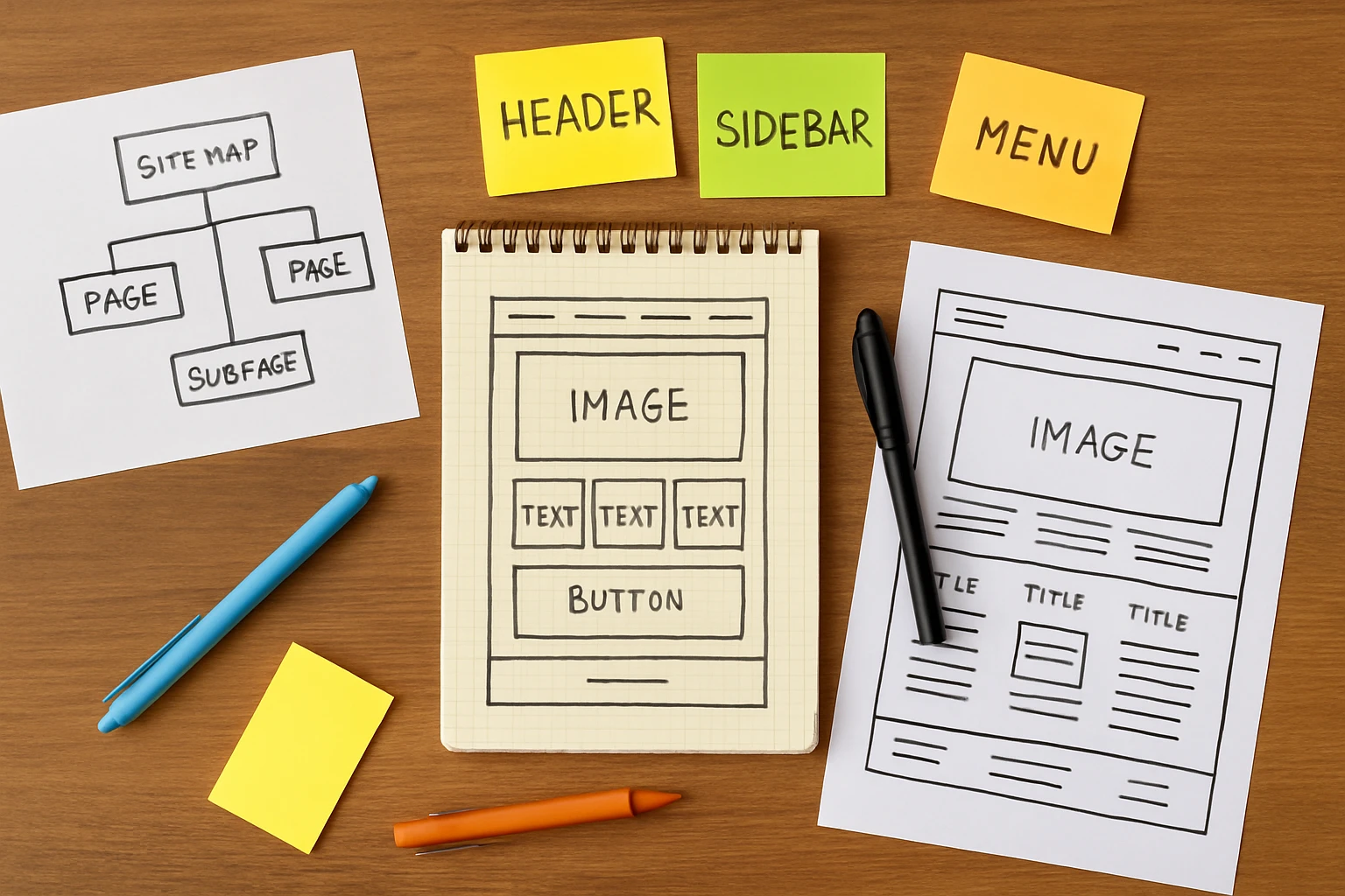
Information Architecture: The Backbone of Simple Sites
Information architecture is how you organize content so users understand where everything belongs. It helps you arrange content in a logical way, which is easy to follow.
On top of tidying up your website, good information architecture builds intuitive navigation, reduces clicks, and speeds up how quickly visitors find what they need.
So when you understand your user needs and group content around them, your site starts to feel straightforward. And that’s exactly what keeps people coming back.
How Users Actually See Your Page Elements
Users never read your website word by word. Instead, they scan it in predictable patterns.
Page elements like buttons, images, and headlines all compete for attention. Which is why the trick is knowing how visual hierarchy works so you can guide users instead of leaving them guessing.
Take a look at these common patterns of the visitors’ natural eye flow.

The F Pattern and Natural Eye Flow
The F pattern explains how users scan content on a web page. They start at the top left corner, read horizontally across, then drop down and scan again in an F shape. This pattern often follows up on text-heavy pages like blogs, articles, and landing page content.
Once you know how to practice this, you can place your important elements along those natural scan lines. For instance, headlines, calls to action, and key messages work best when they sit at the top or along the left edge. That’s where eyes go first, so that’s where your best content should live.
Clear Visual Hierarchy: Size, Weight, and Placement
The right visual hierarchy makes your most important content impossible to miss. This hierarchy uses size, color, and spacing to show users what’s most important on a page. To give you a clearer idea, larger visual elements grab attention first, and smaller ones feel secondary.
Apart from size variations, your color palette can do that, too. Elements like bold or contrasting colors add visual weight and draw attention to call-to-action buttons. White space also helps by giving the main elements room to breathe, which creates visual interest without adding clutter.
You can add a blinking banner ad to grab attention (nobody can miss those). But a clean, well-balanced page with clear visual hierarchy feels professional and easy to navigate. And that’s what adds to your brand’s reputation.
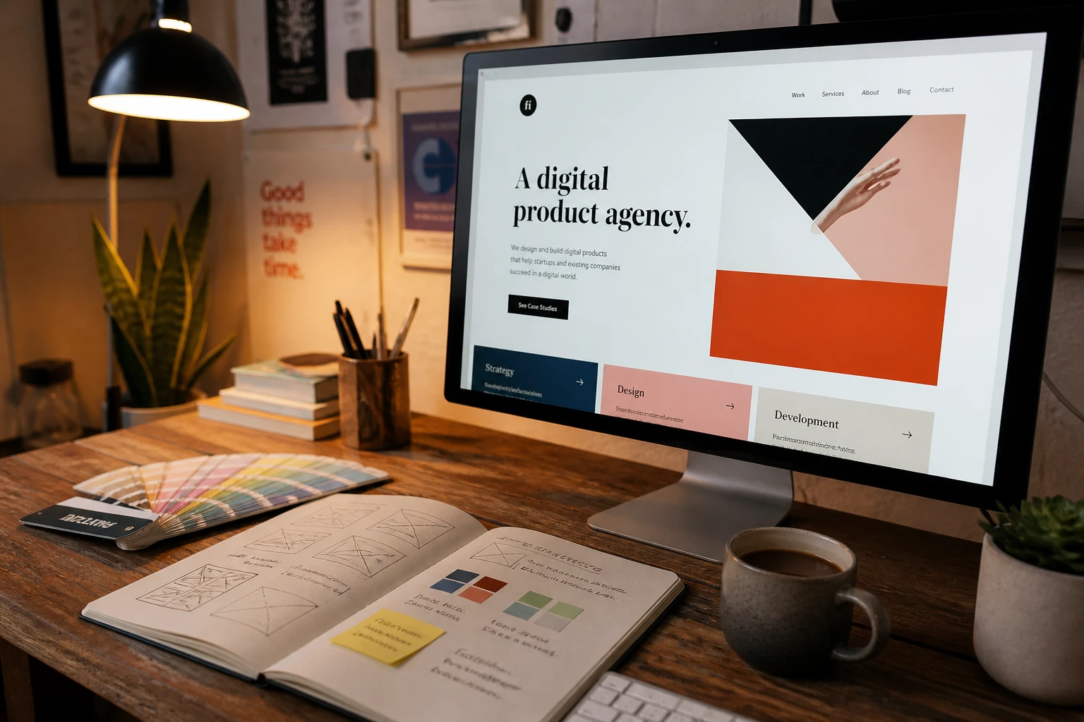
Simple Web Layout Ideas That Work Well
Simple web layouts work well because they guide users smoothly through your content without overwhelming them.
That’s why testing different layout ideas helps you figure out what clicks with your visitors. There are a handful of layout ideas that work well for almost any type of website.
Considering the type of website you have, here are the types of layouts without trying.
Layout for Clean, Balanced Pages
Grid layouts give your site a polished, professional feel without overcomplicating things.
This type of layout divides your page into columns and rows, and sometimes splits it into nine equal parts for visual balance. So that it creates a balanced layout that is easy to scan.
You’ll see this style across many homepage designs, product pages, and portfolios. Pinterest is a classic example. Every pin sits neatly in a grid, and that makes it easy to browse thousands of images without feeling overwhelmed.
Airbnb uses a similar approach for its listing pages in a way that helps users compare options at a glance.
Through our hands-on experience, we’ve found that grid layouts also make your website easier to build and maintain. And once the structure is set, adding new content becomes easy for your team too. So if you want clean and reliable, a grid layout is a solid pick.
Layout for Creative Design Inspiration
An asymmetrical layout breaks away from rigid structure to create visual interest and a modern, artistic feel. This style suits brands that want to grab attention or showcase creativity through unconventional page arrangements.
Many websites in fashion, design, and art focus on this approach for design inspiration. You can check how Rollie Nation, an Australian footwear brand, does this beautifully. Their site uses different-sized images and frames that still feel balanced.
And if you want something really bold, check out Balenciaga or Saint Laurent. Their homepages use artistic images that attract attention.
But here’s a heads up. Too much imbalance can confuse users instead of impressing them. It’s best to use asymmetry with purpose, not just for the sake of being different.
Bonus: You can even use a split-screen layout to divide content into uneven sections, which draws the eye to one side more than the other. A split-screen approach works well when you have two distinct messages or want to highlight a single product.

Make Your Website Feel Easy to Use
Making your website easy to use comes down to removing obstacles between visitors and their goals. A user-friendly site doesn’t make people think too hard. You know when the buttons are where you expect them, the text is easy to read, and the pages load fast.
Keep in mind that frustrated visitors won’t go up to complain. Instead, they’ll just bounce. And once they’re gone, getting them back is almost impossible.
This is how you can build a smooth user experience from day one.
Create a Website With the User in Mind
Before you create a website, spend time understanding your target audience. Try to figure out what they need. How do they like to browse? What problems are they trying to solve? Every design project decision becomes easier when you know these answers.
We suggest mapping out their journey from the first click to the final action. Each step should feel logical and smooth. It helps you spot gaps before they become problems later on.
Honestly, we’ve seen how this part trips up a lot of people. They design based on what looks nice instead of what makes everything easy. But the simplest navigation fixes can make noticeable improvements in user flow.
Build a Site People Actually Enjoy
Good web design starts with a solid plan. For that, you need to understand how users see your pages, use visual hierarchy to guide visitors, and pick a layout that fits your goals.
Before you start building, always sketch out your website structure, test it with real people, and tweak based on feedback. Once you have a clear plan, it’s much easier to get the ball rolling on the actual build.
And remember not to rush the process. A little patience now saves a lot of frustration later.
Many web designers can also help businesses build websites people actually want to use. If you need expert help pointing your site in the right direction, contact the team at Gecko Tag.