Picking the right color scheme for your website starts with one question: What do you want visitors to feel?
That’s the starting point. But there’s a lot more behind it.
If you want to learn how color choices influence mood and trust, you’re in the right place. We’ll walk you through what works in web design, what falls flat, and how to skip the common mistakes.
Stay with us, and we’ll help you create a strong foundation, step by step.
Website Color Psychology: What It Means for Your Site
Website colour psychology looks at the link between colors and emotions. Every shade sends a message. While some make visitors feel calm, others push them to take action.
Think of it as a powerful tool that influences user behavior and user engagement without saying a word.
You might be thinking: how much can a color really do? Well, more than you’d expect.
The right shades create feelings of safety, excitement, or readiness to take action (Yes, people judge that fast). Meanwhile, poor color choices push visitors away before they read a single element on your page.
So how do you pick the right ones? It starts with color theory.
How Does Color Theory Affect a Website’s Mood?
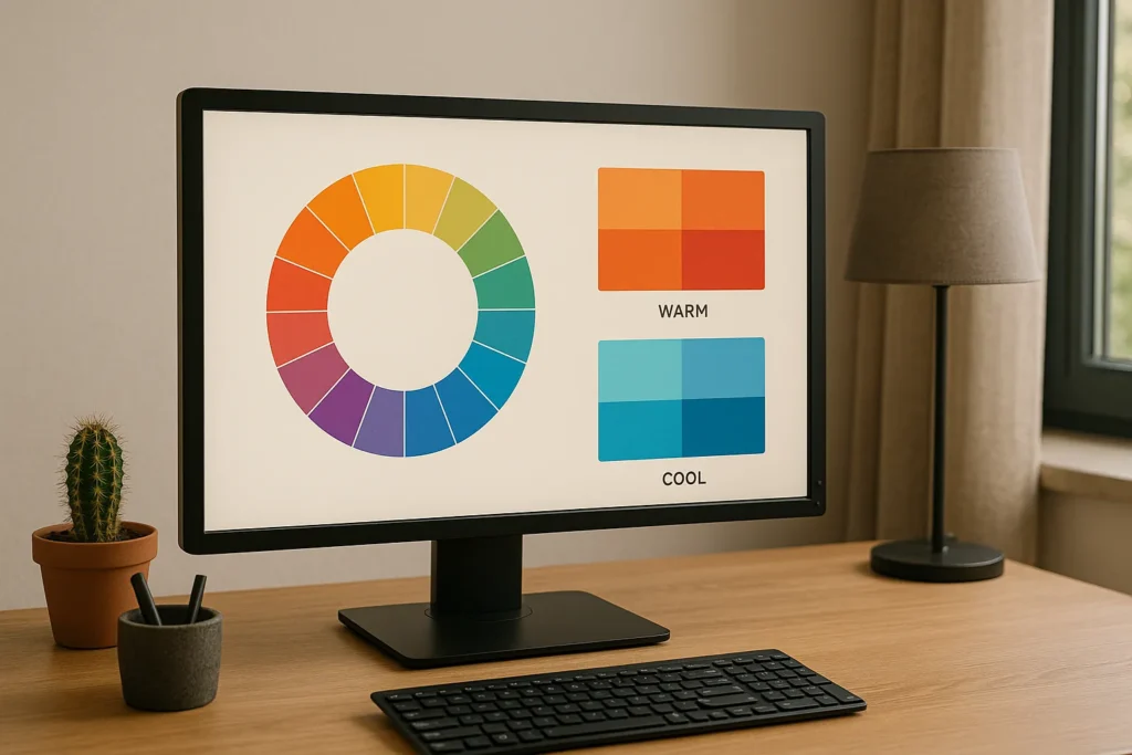
Color theory shapes mood by sorting colors into warm and cool groups. Each group triggers a different feeling. Warm tones excite, and cool tones settle. That’s the foundation.
Now, let’s look at both in action.
Warm Colors Add Energy
Reds, oranges, and yellows grab attention fast. These vibrant colors create urgency and an energetic vibe that’s hard to ignore.
And that’s where things get interesting. They work best for call-to-action buttons, sale banners, or brands with bold colors and big personalities.
But here’s the catch. Too much warmth can overwhelm users, so don’t overdo it.
Cool Colors Build Trust
Blues, greens, and purples create feelings of calm and dependability. Right off the bat, users tie these cool tones to reliability.
That’s why many financial institutions, healthcare sites, and tech companies lean on these colors to signal trust and stability from the moment someone lands on their site.
And you can do the same with these cool-toned colors. They work great as backgrounds or for major design elements since they add depth without fighting for attention.
Useful Tip: Try a tool like Adobe Color and test different combinations on a color wheel. From there, you can see what clicks and what doesn’t.
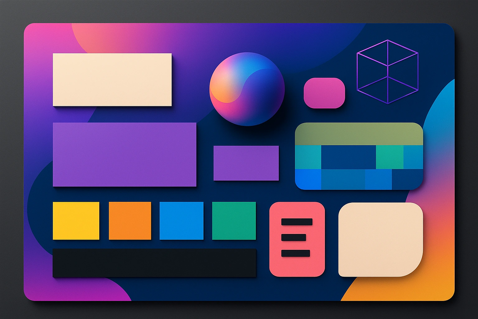
Friendly Color Palettes That Work
A well-chosen color palette does half the work for you. It sets the right tone without saying a word.
Let’s be real here. Most visitors won’t notice the colors you pick, but they’ll feel them the moment they land on your website.
Take soft cool blues paired with warm accents. They create a balance between trust and approachability. From what we’ve seen, earthy and natural tones give off a relaxed vibe that visitors enjoy. These muted tones add depth without overwhelming the page.
When you look at the bigger picture, every color scheme either supports your message or weakens it.
If you’re not sure where to start, try creating mood boards or a Pinterest board to test color combinations before going live. It’s a quick visual representation of how your palette fits your target audience.
One more thing to keep in mind. Don’t skip WCAG accessibility standards since they make sure everyone can read your content (including users with visual impairments).
Color Usage and Brand Identity
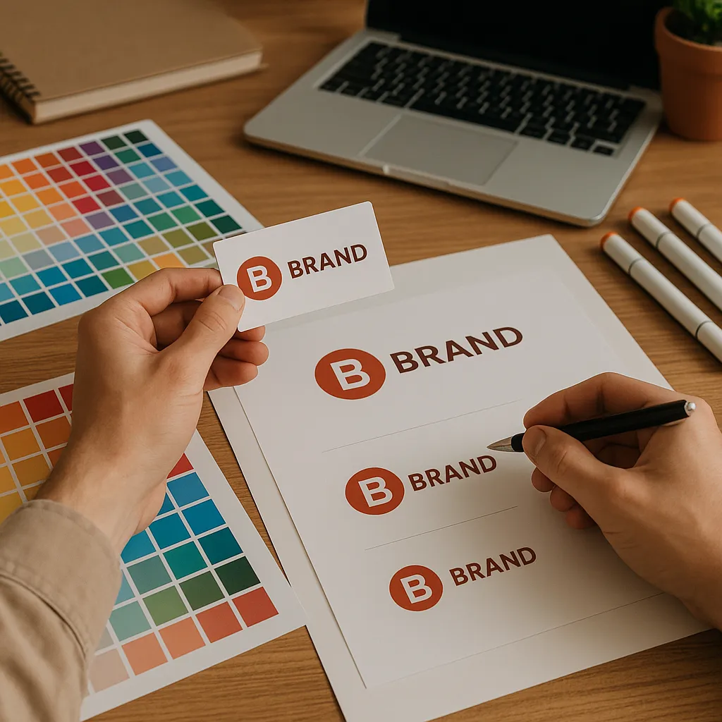
Ever notice how you can spot certain brands just by their colors? That’s no accident. Color usage directly affects brand identity and brand perception. It comes down to consistency and alignment with your message.
Consistency Across Pages
Stick to the same color scheme across every page. Over time, it builds brand recognition. People start linking those colors to your name, even before they read it.
In our experience, visitors start tying those brand colors to your business and what you offer. But random shifts break that connection.
For example, jumping from a calm blue homepage to a bright red checkout page throws visitors off. Your site ends up looking unpolished and easy to forget.
Helpful Tip: Keep your color theme tight across all design elements. That way, you stay on the same page with your audience.
Matching Colors to Your Message
While playful brands go bright, professional ones stay muted. The choice comes down to one thing: your color scheme should reflect your brand’s personality, voice, and target audience.
Think about it. A children’s toy store and a yoga studio will never share the same color theme on their websites. Toys call for vibrant, high-energy shades, while yoga spaces lean on softer tones that help people unwind. (We’ve all landed on a site that felt like a neon explosion.)
When you’re adding a specific colorkeep different cultures in mind. The reason is simple. Different colors mean different things around the world. And that confusion can cost you customers, especially on modern websites where first impressions are everything.
What Other Elements Support Your Color Theme?
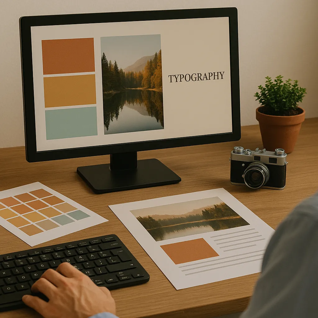
Typography, images, and layout all support your color theme when they share a similar tone and style. Colors don’t work alone. Fonts, visuals, and spacing need to pull in the same direction.
Pick a simple typeface with clean lines. Pair it with a soft background, and you’ve got something cohesive. Your website becomes easy to read, too.
Images follow the same rule. Stock photos with clashing tones break the mood fast. One off-brand visual, and the whole design feels off. That’s why you should keep your visual elements tight and the contrast balanced.
Now that the pieces are in place, let’s wrap things up with a few practical tips to get you started.
Pick Colors That Welcome Your Visitors
The wrong color scheme can push visitors away before they even scroll. That’s a problem most sites face without realizing it. But with the right color choices, your web design can feel warm, trustworthy, and easy to use.
We covered how color psychology shapes user behavior, how to build friendly palettes, and why brand consistency matters. These practical tips give you a clear starting point.
Stop guessing and start designing with purpose. Your site deserves colors that connect with your target audience and create real results.
Our team at Gecko Tag will take you through every step you need to get it right.