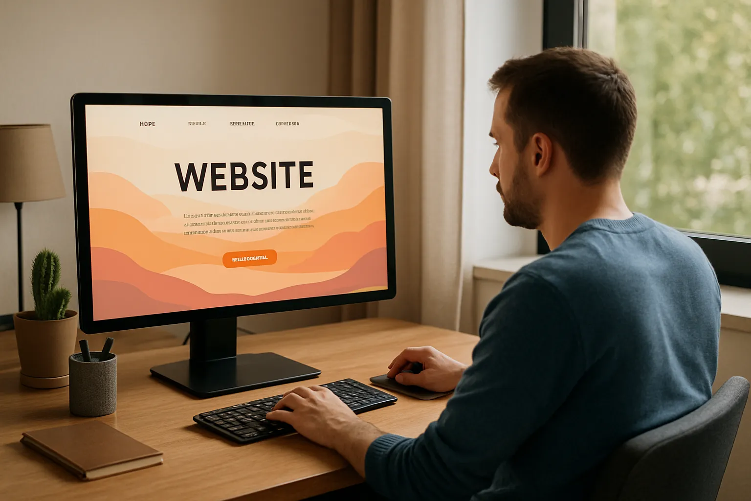
You know exactly what you want for your new website. But the moment someone asks you to write it down, everything gets harder to explain. Should you start with your logo? Your favourite colours? A site you saw once and liked? What even goes into a web design brief?
If the idea of briefing a web designer gets you lost, you’re in the right place. Most people struggle to translate creative thoughts into clear direction.
Too often, people leave out the important stuff, simply because no one told them what to include. That ends here. This guide will help you share your ideas clearly and get the results you want.
Let’s start by clearing up what a design brief really is, and why it matters more than you’d expect.
What’s a Design Brief?
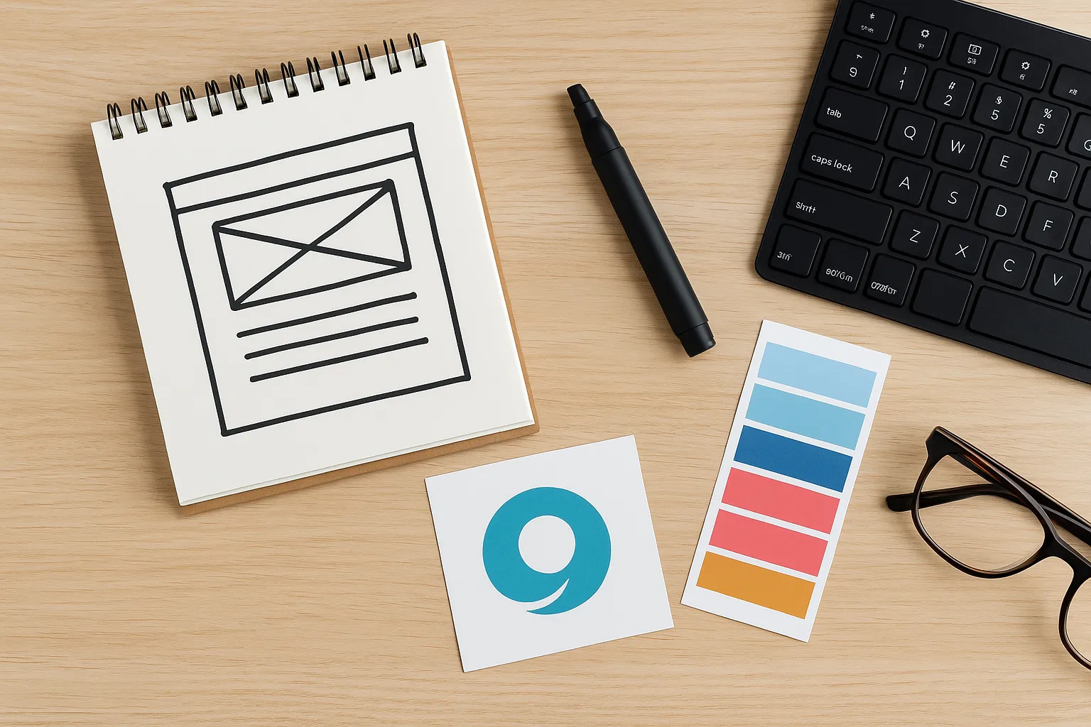
A design brief is a written document that outlines your goals, brand identity, target audience, and the necessary functionality for your website. It gives your designer a clear roadmap so everyone’s on the same page from the start.
Here’s what it’s not: a vague list of preferences like “make it clean”, a one-line email with a competitor’s link, or something rushed together at the last minute. These approaches leave too much open to interpretation and often lead to misalignment, frustration, and extra revisions.
Why a Clear Design Brief Matters
A clear brief sets the tone for your entire web project. It reduces back-and-forth, minimises miscommunication, and gives your designer a strong foundation to build on. It’s your chance to lay out your vision from the start, so the end result feels intentional.
Compare this: one client says, “I want something modern that pops.” Another says, “I want a clean layout with lots of white space, soft blues, and imagery that reflects calm and trust. My audience is mostly health-conscious parents, and I want them to feel safe here.” The second client gives the designer something solid to work with. That kind of clarity leads to better, faster results.
So, what exactly goes into making a clear design brief?.
The Ultimate Checklist for a Winning Design Brief
Too many people hand over a design brief with crossed fingers. “Hope they get it,” they think. But when you know what to include, you take the guesswork out of the process.
The best web projects start with clarity, and that begins with a solid brief. Keep it simple. Just the basics your designer needs to get started.
Here’s what you should definitely include:
- Who you are: Share a summary of your business: What do you do, and why does it matter? This helps your designer understand the bigger picture. For example, “We’re a local fitness studio helping busy professionals stay active through short, high-intensity workouts.”
- Your brand identity: Provide details about your logo, colours, typography, and tone of voice. Is your brand playful, serious, luxurious, or minimalist? A brand that uses humour and bright colours will need a very different design from one that’s elegant and reserved. Attach any brand guidelines or mood boards if you have them.
- Your audience: Describe your ideal customer or user. What do they care about? What problems are they trying to solve? For instance, “Our audience is new parents in their 30s, mostly based in urban areas, looking for eco-friendly baby products.”
- Your website goals: What do you want people to do on your site? Your goals could be selling products, booking appointments, gathering newsletter sign-ups, or helping visitors understand your services. Pick the most important ones so your designer can build the site around them.
- Key features and functions: List the tools or components your site needs. This might include things like an online store, booking form, blog, portfolio, or live chat. Be as specific as possible. “I need customers to book a class and pay online” is far more useful than “just a simple form.”
- Content status: Are you providing all the copy and images, or do you need support? If some content is ready and other parts are not, let your designer know. You could say, “We have headshots and product photos, but need help writing the About page and product descriptions.”
Think of it like gathering ingredients before baking. The clearer your list, the better the result. A good brief gives your designer what they need to make something that looks great and works for your business.
Once your brief is in good shape, the next challenge is making sure your designer understands what you actually mean. Strong communication at this stage keeps the whole project running smoothly. Let’s talk about how to avoid miscommunication.
Tips to Prevent Miscommunication in Design Projects
The biggest design fails usually start with one problem: assumptions. You assume your designer knows what you meant. They assume you were happy with their interpretation. And suddenly, you’re both frustrated.

A PwC survey revealed that effective communication is linked to a 17% increase in finishing projects within budget. With clear communication, you can avoid delays and confusion, which makes the whole process easier and more productive. Let’s break down how to keep things clear and on track.
Be Specific
General feedback like “make it pop” or “it needs something” doesn’t give your designer anything concrete to work with. Instead, explain what you mean.
Try something like: “This section feels a bit cold. Can we try warmer colours and rounder shapes to make it feel more welcoming?”
That kind of detail helps the designer make informed, creative decisions that align with your vision.
Explain the Why
Designers don’t just want to know what you like or dislike. They want to understand why so they can apply that thinking across the whole project. Saying “I don’t like this font” is less helpful than “This font feels too corporate. We’re aiming for something friendlier.”
When you explain your reasoning, your feedback becomes more valuable, and your designer can make better choices that carry through consistently.
Keep Feedback Honest and Friendly
You don’t need to apologise for giving feedback (people are too sensitive these days). A kind but clear comment saves everyone time. If something doesn’t work for you, say so.
For example: “I know we discussed minimal design, but this layout feels too empty. I think our audience might miss key information.”
A good designer values honest feedback, but if your feedback is unclear or comes too late, it can cause stress. Speak up early, and you’ll avoid last-minute fixes.
Good feedback helps a lot, but pairing it with the right tools and habits makes collaboration even easier.
Streamline Your Web Design Project with These Collaboration Tools
What if a simple tool could save hours of back-and-forth in your web project? Smooth collaboration keeps things moving, and the right tools help make that happen faster and with less friction.
But tools alone aren’t enough. It’s how you use them consistently and clearly that closes the communication gaps and keeps everyone aligned.
Tools That Keep Everyone Aligned
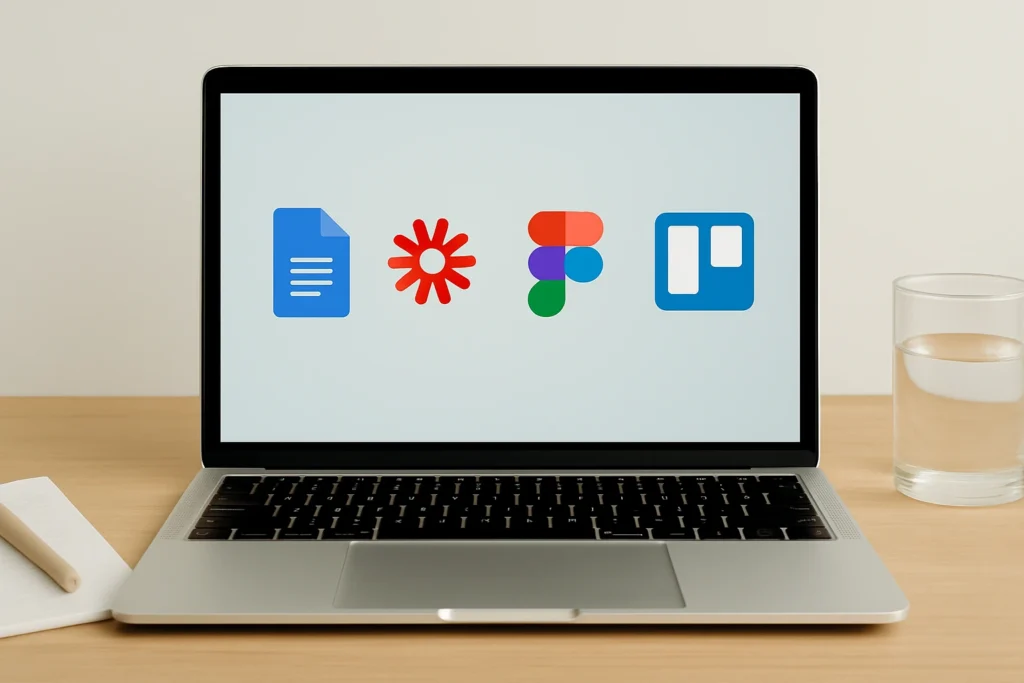
- Google Docs: Perfect for shared text content, comments, and real-time edits. Use it for your brief, copy drafts, and feedback notes. The “suggesting” mode can help your designer track edits without losing your original thoughts.
- Trello: A visual task board to track project stages and deadlines. It helps everyone see what’s in progress, what’s approved, and what’s still pending. You can add labels or checklists inside each card to keep tasks grouped by content, design, or development.
- Loom: Record quick videos to explain your thoughts or give visual feedback. It’s faster and clearer than typing long explanations. It also helps you communicate tone, which can often get lost in text alone.
- Figma: A design collaboration tool where you can view, comment on, and suggest changes to your designer’s mockups directly. Adding comments right on the design keeps your feedback in context and avoids confusion later on.
Each of these tools helps keep the conversation open, structured, and visible to everyone involved.
Build Collaborative Habits
Don’t rely on memory or scattered email threads. We recommend scheduling weekly check-ins, keeping a shared doc for feedback, and creating a simple log of decisions made. This reduces confusion and makes sure nothing important gets missed.
Above all, remember this: no tool replaces real conversation. Use these platforms to stay connected. When something feels unclear, speak up. A quick chat beats days of back-and-forth. Clear habits, paired with the right tools, turn a good working relationship into a great one.
And just as good tools and habits keep the process on track, setting clear expectations can prevent misunderstandings before they even happen. Let’s look at what you and your designer should agree on from the start.
What to Clarify With Your Designer Before Starting a Website
One of the quickest ways a web project can go off track is when expectations aren’t clearly set. Even with a great brief and open communication, you and your designer need to agree on the practical boundaries of the work. This is especially important when it comes to time, deliverables, and post-launch needs.
To avoid surprises later, make sure you’ve talked through these practical details:
Timelines
Be realistic about how long things take. A fully custom site with complex functionality not only involves design, but also strategy, testing, revisions, and technical setup. If your timeline is tied to a specific event or product launch, bring it up early so your designer can plan around it.
Scope and Revisions
Clarify what is included in the original quote. A homepage might include design, layout, and responsiveness, but not content writing or sourcing images. Also, define how feedback is handled. For example, will there be two rounds of revisions per page? Is extra work billed by the hour? Clear answers here help avoid delays and unexpected costs.
Post-Launch Support
Once your site is live, things don’t just stop. It’s worth asking what kind of support comes next. This might include software updates, plugin maintenance, or changes to content. If your business changes often, it’s smart to have a plan for future tweaks.
Budget Boundaries
If your budget is fixed, be upfront about it. Let your designer know what’s most important to you so they can help make smart design choices. And don’t forget to ask about any extras that aren’t included, like extra pages or mobile-friendly upgrades.
When expectations are clearly outlined from the start, your project is more likely to stay on time, on budget, and free from last-minute surprises.
With the logistics sorted, it’s time to talk about something just as important but often overlooked: emotion. The feeling behind your brand can be one of your strongest design tools.
How Emotional Design Improves User Experience on Your Website
A website is a reflection of your brand’s personality, and it should make people feel something. That emotional connection is often what sets a good site apart from a forgettable one. When briefing your designer, don’t shy away from describing the mood and atmosphere you want to create.
Instead of focusing only on structure or functionality, think about how your audience should feel when they land on your site:
Welcomed and Calm
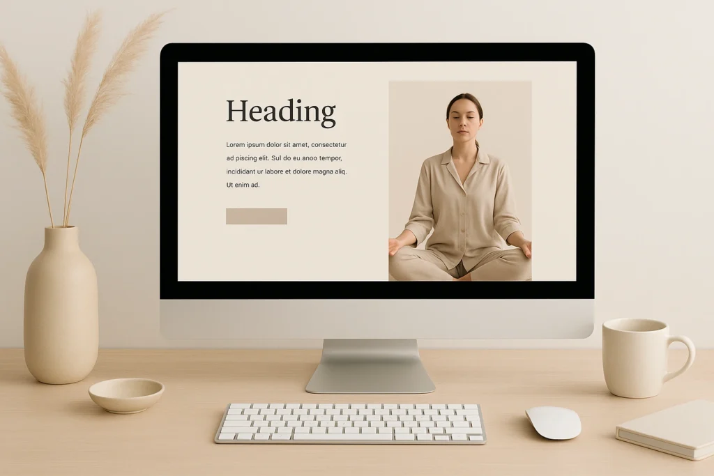
Best for wellness brands, counsellors, or service-based businesses that deal with personal issues. These sites often use open layouts with soft color schemes and minimal distractions to create a peaceful space. For example, a meditation coach’s site might feature soothing blues, simple menus, and plenty of white space to keep things calm and inviting.
Confident and Motivated
This style suits consultants, coaches, or SaaS products by focusing on clean lines and bold headlines to grab attention. The strong contrasts and sharp design elements help convey authority and energy, such as a leadership coach’s website might use bold typography, crisp layouts, and vibrant colors that show confidence and drive.
Curious and Engaged
To spark interest and encourage interaction, this style works perfectly for educational platforms or creative portfolios. These designs often include textured details and unexpected layouts to spark interest. For instance, a design agency’s portfolio could feature hover animations, layered images, and a playful setup that encourages visitors to explore.
The emotional tone you aim for can directly shape how your designer approaches layout, typography, movement, and even micro-interactions. If you’re not sure how to describe it, think about what you don’t want. That contrast can be just as helpful.
When you share the feeling you want to create, you invite your designer to think beyond visuals. It becomes a creative direction instead of only a style choice, and the end result feels much more human.
Turn Your Brief Into a Website That Works
A solid web design brief doesn’t limit creativity. It gives your designer the direction they need to explore ideas that actually align with your goals. And it gives you clarity about what to expect and how to stay involved.
You don’t need to get everything perfect on the first try. What matters most is being honest, clear, and open to collaboration. Share what you care about, explain your choices, and keep the lines of communication open.
Great websites are co-created. Your ideas, feedback, and clarity play a big part in the final result. Now that you know how to brief with confidence, you’re ready to create something that truly reflects your vision.