If you’re looking for tips on typography in web design, you’re in the right place. Typography is one of those tools that improves how your website functions. When you choose your web design fonts perfectly, visitors absorb your message quickly and move through your site without much effort.
But many people don’t understand its impact and get it wrong. The good news? It’s easy to fix.
In this article, you’ll learn how typography affects web design, how to adjust it for different devices, and which tools help you test and refine your choices. We’ll break down everything you need to know to choose and use web design fonts that boost your conversion.
Stick with us to learn what makes web fonts work best.
The Role of Typography in Effective Web Design
Your fonts decide what visitors notice and how long they’ll stay engaged. Clear, well-structured text encourages users to read your content, and good typography makes it easier for them to find what they’re looking for. It’s a win-win for everyone. Smart use of design elements like spacing and font size can also make your layout feel more professional and polished.
Typography influences first impressions
The font you choose sets expectations about your brand’s tone and professionalism. A clean, modern typeface conveys trustworthiness and clarity, while a more decorative font might suggest creativity or playfulness. But if your typography feels off, people may leave without exploring further.
It creates reading flow
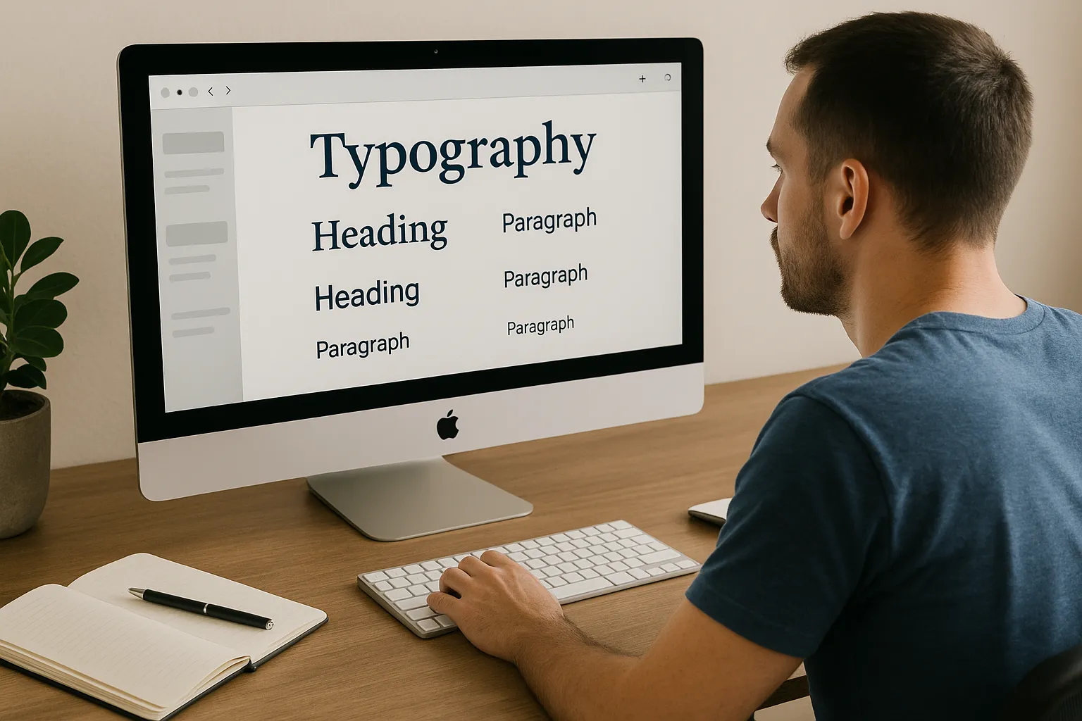
When you choose the size, spacing, and even the weight of your font strategically, it guides the users on what to read first and what can wait. That’s why you should maintain a hierarchy.
For example, the fonts of your headings need to stand out from the rest of your content, and the body text should be comfortable to read. Also, calls to action (CTA) need to be placed in a way that grabs attention. If everything is structured with this kind of balance, your site feels more inviting, and users are more likely to stay and engage.
It supports decisions
Easy-to-read text means less friction when users try to act, like clicking a link or filling out a form. When information is presented clearly and predictably, users are more likely to engage with your content and complete desired actions. For example, signing up for a newsletter or exploring products.
A study from the MIT AgeLab highlighted that poorly styled text increases reading time and eye strain, especially on mobile devices. Their research emphasises the importance of typography in glance-based environments, where users capture information in short bursts of attention.
After testing it, we found that updating the font hierarchy on a service page reduced bounce rates by 12%. We adjusted heading sizes and improved line spacing, which helped users scan the content they needed right away. So, they stayed longer and interacted more with the page.
Strong typography starts with choosing the right typefaces. Let’s look at how font styles like serif and sans serif affect the way your message is received.
Choosing Between Serif and Sans Serif Fonts
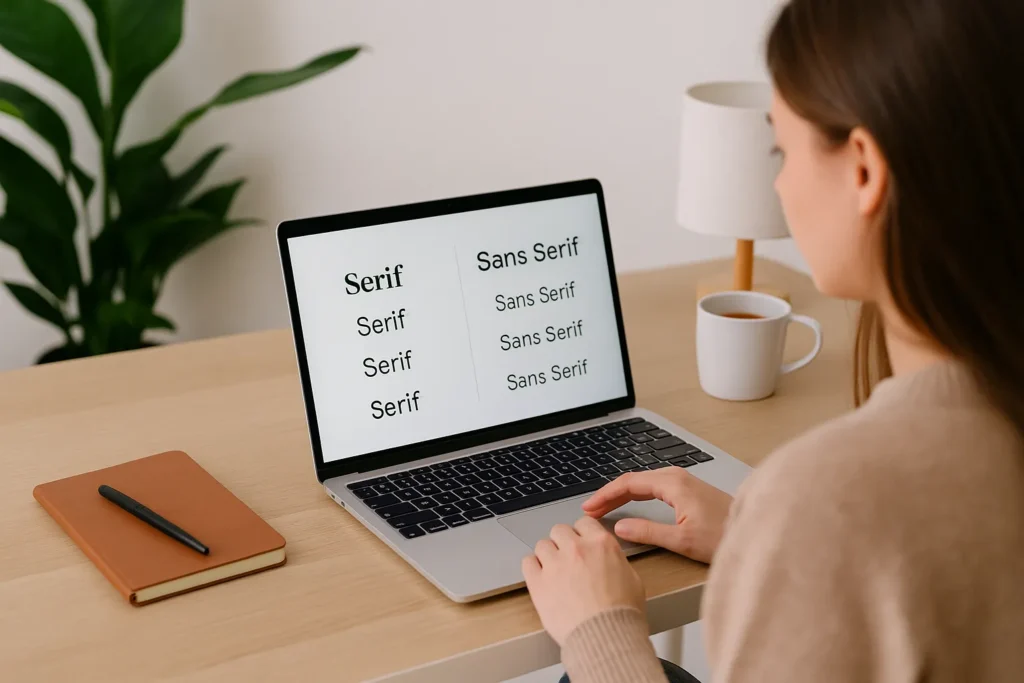
Fonts come in different styles, but two of the most important types are serif and sans serif. If you want your text to be easy to read and look good, it’s important to understand when and where to use each one.
Serif fonts have small strokes at the ends of each letter. They feel more traditional and are often used in print or for branding. These fonts can work well in headings or logos. But for long paragraphs or mobile reading, they can make the text feel busy and harder to scan.
That’s why it’s often best to go with a simple, clear font. Sans serif fonts have a cleaner look and are more popular in web design. A sans serif typeface like Roboto or Open Sans keeps its shape and clarity across all devices. These fonts also load faster and give your pages a modern feel.
And don’t forget, your content also needs to be easy to read. Readability refers to how quickly someone can understand your content and how easily they can move through the text. Sans serif fonts usually make that easier, especially on smaller screens.
After trying out this approach on a recent project, we swapped a client’s body text from Georgia (a serif font) to Lato (a sans serif). The result? Readers stayed longer, and readability scores on mobile went up by 14% . The site felt lighter, cleaner, and more inviting.
Serif fonts still have their place, especially in headers or when you want to give a classic look. But if you’re aiming for clarity and flow, start with sans serif.
Once you’ve picked the right font, the next step is making sure it works everywhere, from large screens to small phones.
Responsive Typography for All Devices
Ever opened a site on your phone and found the text too small or too tight? It’s a typography issue that affects how people use your site. Responsive typography makes your content easier to read on all screen sizes, from laptops to mobile devices.
Here’s how to make sure your typography works across different devices:
- Font size: Use rem units instead of pixels. A rem is based on the root font size of your site. So if your base size is 16px, then 1rem equals 16px. In this way, your text remains flexible and adjusts effortlessly, no matter how the screen size or browser settings change.
- Line height: Make sure the space between lines is at least 1.5 times the font size. This makes text easier to read, especially on mobile where screens are tighter and users need more breathing room.
- Letter spacing: Add a little extra space between letters on mobile so that each word stands out better and makes the text feel less cramped. People with vision issues or dyslexia find it easier if there is more line spacing available in the text.
Based on our observations, adjusting font styles for smaller screens helped reduce bounce rates by 11%. Readers stayed longer, and pages felt easier to scroll.
Now let’s look at the tools that can help you design responsive, readable typography with less guesswork.
Typography Tools
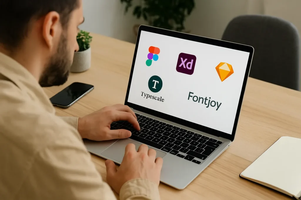
Choosing the right tools can make your typography process smoother and more strategic. They help you design faster, test ideas visually, and ensure your fonts look great on every screen. If you’re refining your UI design or selecting web design fonts, these tools can be useful for you:
- Figma: Figma is a cloud-based design software that many web designers use for creating and testing typography. It lets you work with your team in real time and has built-in font libraries. You can preview font changes live and adjust your layout quickly. It’s great for building responsive designs that scale well across all devices.
- Adobe XD: Already using Adobe Creative Cloud? Adobe XD fits right in. It’s great for building layouts and previewing how your typography will look on different devices. Its responsive resize tools and shared styles help keep your design consistent.
- Sketch: For Mac users, Sketch is a long-time favourite. It’s known for clean design and easy-to-use tools. You can build reusable styles, tweak spacing, and manage fonts without digging through complicated menus. Plus, there are plenty of plugins to extend its power.
- TypeScale: Trying to set up a consistent font system? TypeScale does the math for you. Pick a base size and ratio, and it gives you a full scale of font sizes to use in your layout. It’s perfect when you want your typography to feel balanced from top to bottom. Test it out at TypeScale.
- Fontjoy: Fontjoy uses AI to pair fonts that work well side by side, great for heading and body text combinations. You can lock one font and let the tool match the rest. Fontjoy is especially beneficial for designers looking to experiment with new font pairings.
Pro tip: Start every design by setting your base font size and spacing. This makes it easier to stay consistent and scale your typography as your layout grows.
Each of these tools can help you create better web typography without wasting time second-guessing your choices.
Let Your Typography Do the Talking
Typography affects how your web pages feel, how easily people read your content, and whether they stick around or move on. Smart font choices can turn a cluttered layout into something smooth, engaging, and easy to use.
Throughout this guide, you’ve learned how typography supports user experience, strengthens your brand message, and creates flow across your website. From choosing the right font types to designing for different screen sizes, every step helps your site feel more polished and professional.
If you’re ready to improve the visual appeal and clarity of your web content, now’s the time to take action. Whether you’re designing from scratch or refreshing an existing site, your typography should be doing more of the heavy lifting.
Visit our website, Gecko Tag, to explore how we can help you create a website that looks and works better for your business and your users.